“For real musicians there is a spiritual component to what they do thats got nothing to with worldly success. Their music is much more of an inner journey. Any other success is just frosting on the cake. There is the idea you can go on American idol and suddenly become a star, but if you bypass that spiritual work your success will be wafer thin."
—Sting speaking in the documentary “Twenty Feet from Stardom”, 2013 (at 1:11:00) 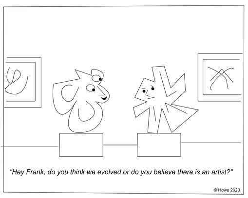 One of the things I enjoy about this cartoon is that I never quite understood what it was saying.
Idea for a cartoon: There are two paintings hanging next to each other in a museum and they are conversing while watching viewers pass by. One painting says to the other "Sure, you can call them human if you want, but what do they really mean?"
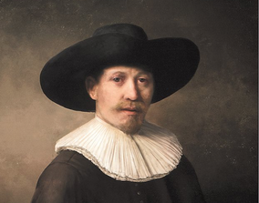 Painting by Rembrandt Painting by Rembrandt I read an article about a computer that painted a perfect copy of a Rembrandt painting. I'm a big fan of the artist vs robot topic. I believe that very soon AI will not only be able to copy any artistic styles perfectly, it will also create its own styles that are unimaginable to humans, leaving human originality in question. However, robots will always have one major limitation compared to the human artist: Robots will never be able to create something beautiful as the result of their suffering.
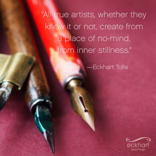
 It's a nice pop aphorism. But what Einstein actually said was "You cannot solve a problem at the same level of consciousness that it was created."
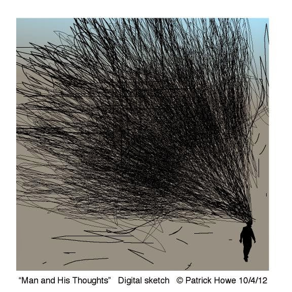
So how does this related to making art? The higher our level of consciousness, the easier it is to solve the toughest problems of art.  Another day at the office and I am looking forward to playing.
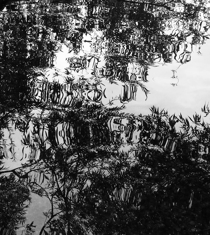 I took this photo at Green Lake, in Seattle, today. It is giving me some painting ideas.
 Artist Agnes Pelton said she painted landscapes to feed her stomach but her imaginative works to feed her soul.
Some artists starve their stomachs, some starve their souls.—PH 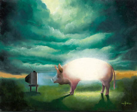 Title of the painting: "The Sun Who Became A Pig Then Forgot He Was A Sun", 8" x 10" Oil on board.
Explanation When people look at this image most see a painting of a pig watching TV. On a deeper level, the pig image was inspired by an ancient Greek tale in which a god was challenged to become mortal. It was believed by the other gods that the mortal world was so intoxicating and sensuous that even a god would forget his godliness upon visiting there. However, one of the greatest gods accepted the challenge and proclaimed that he would become mortal for three days and then under his own powers return to the god-world. He chose to become a pig. But as soon as he became a pig he forgot his godliness because of the overwhelming, intoxicating and sensual pleasure of wallowing in mud and rooting for tubers, nuts and insects. After three days he only knew that he was a pig and nothing more. Finally, it took several gods using their supernatural powers to bring him back to the god-world where even after he was transformed back into a god he continued crawling on all fours and oinking like a pig for days. In a contemporary interpretation the image is a metaphor for how we have become lost in the affairs of the world and have forgotten our true identity. Which isn’t that we are Greek gods, but something far greater.
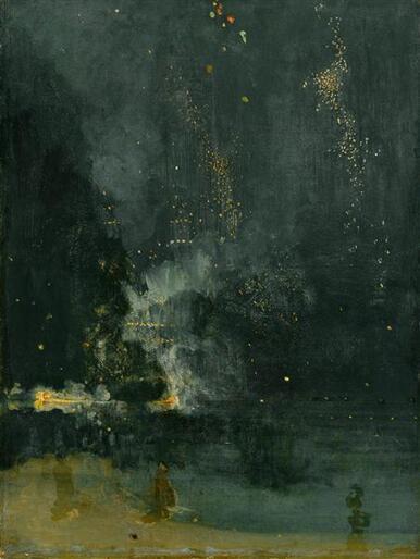 “An artist is not paid for his labor but for his vision.”
— James McNeill Whistler I address the true value of art in my book "The Awakening Artist". "Nocturne in black and gold" by Whistler 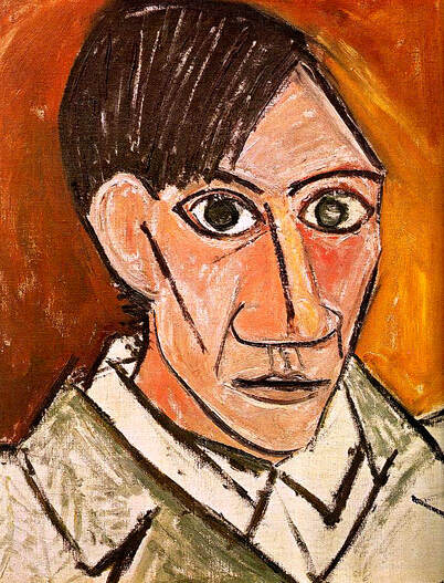 “Art washes away from the soul the dust of everyday life.”
— Pablo Picasso I try to make my online oil painting classes a place of peace and creativity. It's good for the soul. Picasso Self Portrait |
AuthorPatrick Howe Archives
April 2024
Categories
All
|
 RSS Feed
|
|
Copyright © 2023, by Patrick Howe, all rights reserved.
Patrick Howe, Artist, Author and Educator Seattle, WA. Contact: patrick@patrickhowe.com |
|