PATRICK HOWE, ARTIST, AUTHOR, EDUCATOR
  • HOME
  • Oil painting classes
    • LIVE CLASSES SEATTLE
    • OIL PAINTING SUPPLIES
    • ENDORSEMENTS
    • ABOUT CLASSES/ REVIEWS
    • OPEN STUDIO
    • GUARANTEE & TERMS
  • PORTFOLIOS
  • RESUME
  • STORE
  • FOR STUDENTS
    • RESOUCE CENTER
    • STUDENT SAMPLES
    • Free Pear Painting Exercise
    • Buying the Right Easel
  • BLOG
  • Contact / Sign up
  • MUSIC
  • BOOKS
  • Tuesday Art Things
    • Introduction Video
    • TAT 10/24/23
  • Thank you
  • Plein Air Painting
  • Photo Portfolio

Deep Space vs Flat Planes in Painting

7/28/2026

0 Comments

 
Deep space in painting must be painted entirely different than flat wall shapes.
Picture
 Here are some excellent examples of flat plane painting, 
0 Comments

Why Do Paintings in Museums Sometimes Appear Dull Compared to the Image of Them Online?

7/7/2026

0 Comments

 
 Here is a Cezanne painting as you would may see the actual painting in a museum:
Picture
 
Here is the same same painting as seen online. The one seen online appears to be much better—brighter! Why is that?
Picture
Here are the two main reasons
1. Our modern eyes have become accustomed to intense color in our environment.
Neon lights, LED billboards, backlit screens, and colorful children's toys. What we see daily didn't exist 100 years ago when great masterpieces were painted. So when someone says paintings by Monet, for example, have wonderful color, you have to understand that statement in context to history.

2. Today, we have colors that are more saturated and brighter than colors they had 100 years ago. For example, we commonly use Phthalo Blue, Quinacridone Red, Phthalo Emerald, and Dioxazine Purple. So, while the Impressionists of the late 19th century were known for their brilliant colors no one had seen before, their colors pale by comparison to the colors we have today.
 Here is what a famous Monet painting would look like in a museum:
Picture
 
And here is what the same painting looks like online:
Picture
Here more reasons
Printed reproductions are often enhanced. Publishers frequently increase saturation, contrast, and brightness so paintings look more vivid on a page or screen. They are not calibrated to match the original painting.

Museum lighting is intentionally low. Many paintings are displayed under relatively low light levels to protect pigments and varnish from light damage. Dim lighting makes colors appear less vibrant.

Aged varnish can yellow. Many older paintings had varnish that has yellowed over decades, muting colors and making the overall painting appear warmer and duller. Conservators sometimes remove old varnish, but not always.

Impressionist technique. Monet, for example, often used broken brushstrokes and subtle color relationships rather than highly saturated pigments. Seen live and up close, the colors can seem doll. Reproductions often exaggerate these effects.

​ Here is what a van Gogh painting would look like in a museum:
Picture

Here is what the same van Gogh painting looks like online:
Picture

So the next time you are disappointed when seeing original paintings in a museum, try to imagine how the paintings were absolutely astonishing in their day.

0 Comments

Why are There more Paintings of Women than of Men in Modern Art History?

6/22/2026

0 Comments

 
One of the most important reasons that women are depicted in paintings more than men is that, historically, the majority of artists, patrons, collectors, and art academy officials were men. These individuals often determined what subjects would be painted and purchased. As a result, female figures were frequently chosen as subjects because they were associated with beauty, grace, fertility, romance, and other qualities that artists and patrons wished to explore or celebrate. This tendency contributed to the development of a long tradition in which women were viewed not only as individuals but also as aesthetic subjects.

The tradition of the nude figure also played a major role. In ancient Greek art, both male and female bodies were depicted, but over time, especially from the Renaissance onward, the female nude became one of the most common subjects in Western painting. Artists often used mythology, religion, or allegory as a justification for depicting unclothed women. Paintings of Venus, nymphs, goddesses, bathers, and other idealized female figures became staples of artistic production. Although male nudes remained important in certain periods, female nudes became more prevalent in later centuries and contributed significantly to the visibility of women in art.

Women were also frequently used as symbols representing abstract ideas. Concepts such as liberty, justice, victory, peace, nature, and even entire nations were often personified as female figures. These symbolic representations appeared in paintings, sculptures, and public monuments, further increasing the number of female images in the artistic tradition.
​

Economic considerations also influenced artistic choices. Artists depended on commissions and sales for their livelihoods, and they often produced works that appealed to the tastes of buyers. Throughout much of European history, collectors showed strong interest in images of women, particularly those that emphasized beauty, elegance, or idealized forms. Consequently, artists had practical incentives to create such works.

0 Comments

What Attracts Us to Some Paintings but Not Others?

7/9/2025

1 Comment

 
Picture
Some paintings attract us more than others due to psychological, emotional, cultural, and aesthetic factors. While taste is subjective, certain elements engage our attention and emotion on a deeper level. These include composition, color harmony, emotional resonance, symbolic content, and the viewer’s personal experiences or cultural background.
​
In the below paintings, observe what each painting evokes in you:
Visual composition plays a foundational role in our response to paintings. We are naturally drawn to visual balance, rhythm, and clarity. A well-composed painting guides the viewer’s eye through the image in a way that feels satisfying or intriguing. The placement of elements within the frame can create tension, harmony, or curiosity. This subconscious visual organization can make a painting feel “right” even before we understand its content.

Color is another powerful attractor. Warm tones such as reds, oranges, and yellows create excitement or warmth, while cool tones like blues and greens evoke calm or introspection. Artists often use color to evoke emotion, and we are often unconsciously drawn to hues that resonate with our internal states or emotional needs.

Beyond formal elements, emotional resonance is a major reason why some paintings attract us. A painting may reflect a mood we’re experiencing or longing for—joy, melancholy, nostalgia, wonder. We are drawn to art that mirrors our emotional world or gives voice to feelings we cannot easily express. This is especially true of figurative or symbolic art, where facial expressions, gestures, and settings invite empathy or contemplation.

Cultural and personal background strongly influence what we find attractive. A painting that references a viewer’s heritage, beliefs, or lived experiences will often strike a deeper chord. Likewise, personal experiences—such as a memory of a place, a relationship, or a trauma—can create a magnetic pull toward certain subjects or styles. This makes the viewing experience unique for every individual.

Lastly, the mystery or originality of a painting can be a powerful attractor. We are naturally curious beings, and when a painting challenges our expectations, invites interpretation, or contains ambiguity, it compels us to look closer. Innovative techniques, unusual perspectives, or imaginative concepts stimulate both the intellect and the imagination.
1 Comment

Surrealist Artist René Magritte (1898-1967)

12/10/2024

1 Comment

 
Picture
I have been talking with some of my students about surrealism lately. As an artistic style, it ranges from the quirky and peculiar to the outright ghoulish and horrifying. The original idea of surrealism was that it supposedly depicted what dreams look like.

René Magritte is one of my favorite original surrealists. He was born in Belgium and was known for his thought-provoking and enigmatic works. He juxtaposed ordinary objects in unexpected ways and challenged perceptions of reality and representation. Iconic works like The Son of Man (depicting a man in a bowler hat with his face obscured by an apple) explore themes of identity, illusion, and meaning. His precise, illustrative style and playful manipulation of context created visual puzzles that engage viewers intellectually and emotionally.​

If you ever hit a plateau with you current painting style, consider painting a whimsical surrealist painting for a change of pace.
1 Comment

Western Art History

10/9/2023

0 Comments

 
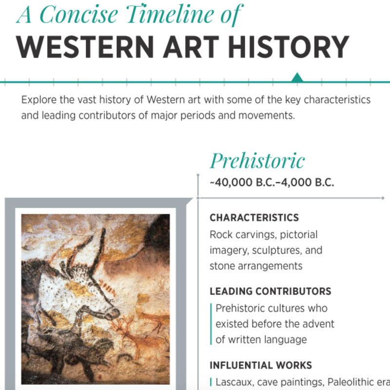
The history of art throughout the world is vast.
And the summary here of Western art history is a good starting point. This Link will take you to a very convenient chronological chart of western art history. And below are styles being explored by painters in my studio.
Picture

In my painting program...
most painters are exploring Contemporary Realism, Impressionism,
Tonalism, Luminism, and Surrealism. Here  are samples of each from art history: 
​
Contemporary Realism

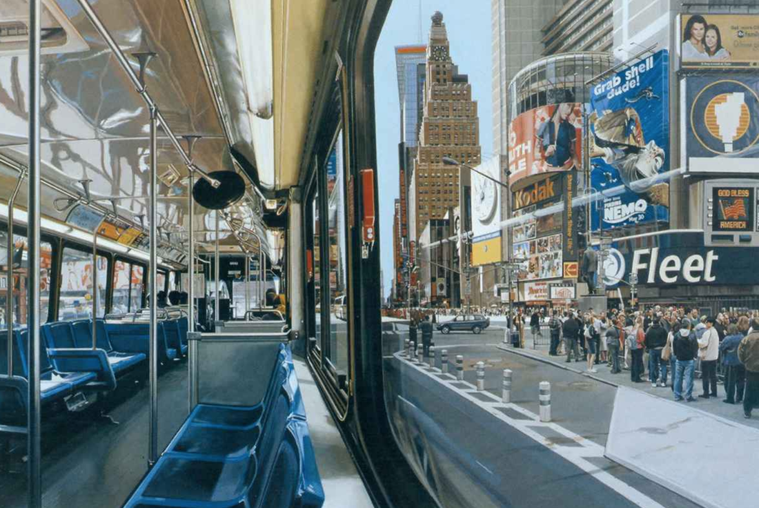
The contemporary realism movement is a worldwide style of painting which came into existence in the 1960s and early 1970s. Featuring a straightforward approach to representation practiced by artists such as Philip Pearlstein, Alex Katz, Jack Beal and Neil Welliver. The movement refers to figurative art works created in a natural yet highly objective style. Today the term Contemporary Realism encompasses all post-1970 sculptors and painters whose discipline is representational art, where the object is to portray the "real" and not the “ideal".
More about Contemporary Realism
About Photorealism
Picture
By Richard Estes

Historical Origin of Realism
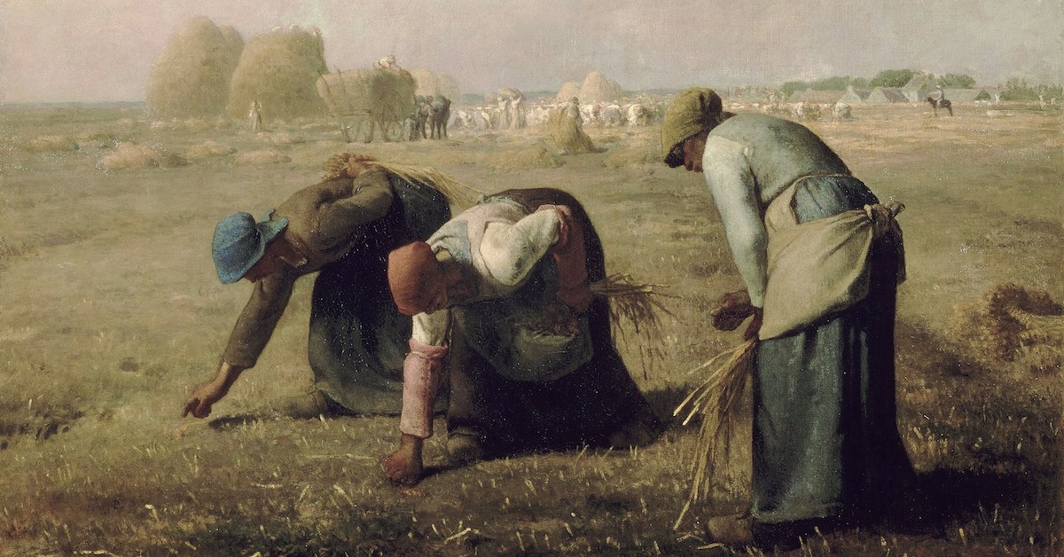
The Realist movement began in the mid-19th century as a reaction to Romanticism and History painting
. In favor of depictions of 'real' life, the Realist painters used common laborers, and ordinary people in ordinary surroundings engaged in real activities as subjects for their works.
More about Realism
Picture
The Gleaners is an oil painting by Jean-François Millet completed in 1857.


Impressionism
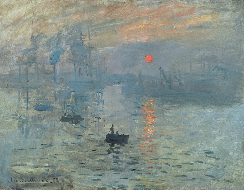
Impressionism was a 19th-century art movement characterized by relatively small, thin, yet visible brush strokes, open composition, emphasis on accurate depiction of light in its changing qualities (often accentuating the effects of the passage of time), ordinary subject matter, unusual visual angles, and inclusion of movement as a crucial element of human perception and experience. Impressionism originated with a group of Paris-based artists whose independent exhibitions brought them to prominence during the 1870s and 1880s.
More about Impressionism
Picture
Impression, Sunrise is an 1872 painting by Claude Monet


Tonalism
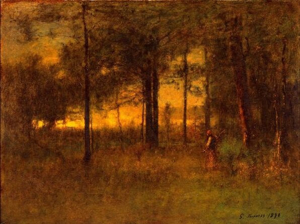
Tonalism was an artistic style that emerged in the 1880s when American artists began to paint landscape forms with an overall tone of colored atmosphere or mist. Between 1880 and 1915, dark, neutral hues such as gray, brown or blue, often dominated compositions by artists associated with the style. During the late 1890s, American art critics began to use the term "tonal" to describe these works, as well as the lesser-known Two of the leading associated painters were George Inness and James McNeill Whistler.
Overview of Tonalism
Picture
"Georgia Sunset"​​ by George Inness

Luminism
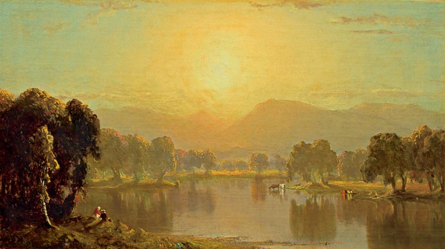
Luminism is an American landscape painting style of the 1850s to 1870s, characterized by effects of light in landscape, through the use of aerial perspective and the concealment of visible brushstrokes. Luminism landscapes emphasize tranquility, and often depict calm, reflective water and a soft, hazy sky. Artists who were most central to the development of the luminist style include Fitz Hugh Lane, Martin Johnson Heade, Sanford Gifford, and John F. Kensett. 
More about Luminism
Picture
"Bend on the Juniata River" by Sanford Gifford

Surrealism
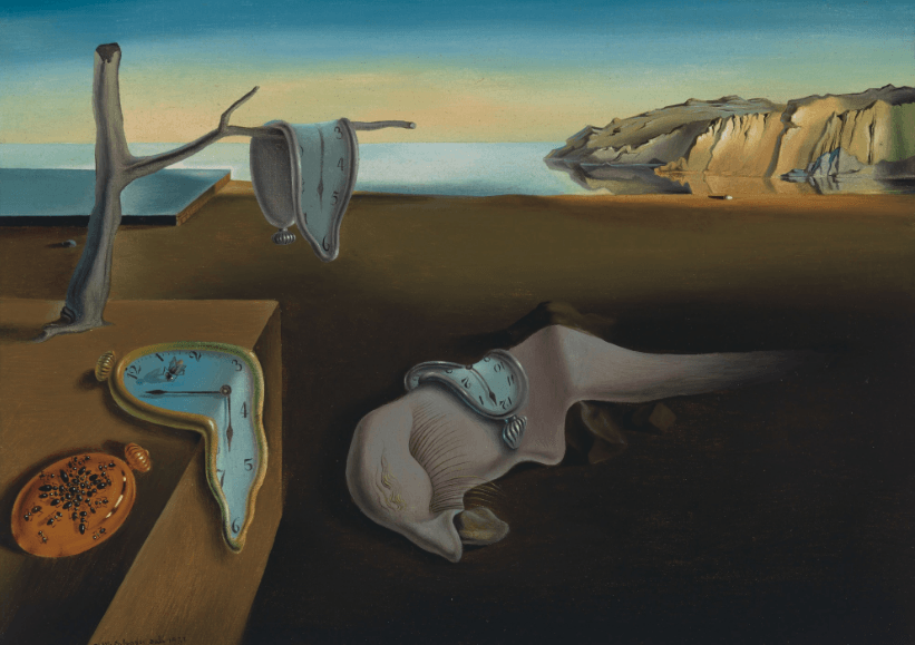
Surrealism aims to revolutionise human experience. It balances a rational vision of life with one that asserts the power of the unconscious and dreams. The movement's artists find magic and strange beauty in the unexpected and the uncanny, the disregarded and the unconventional.
More about Surrealism
Picture
"The Persistence of Memory" 1931 Salvador Dali
0 Comments

Comparing the Paintings of Monet and Renoir

6/20/2023

1 Comment

 
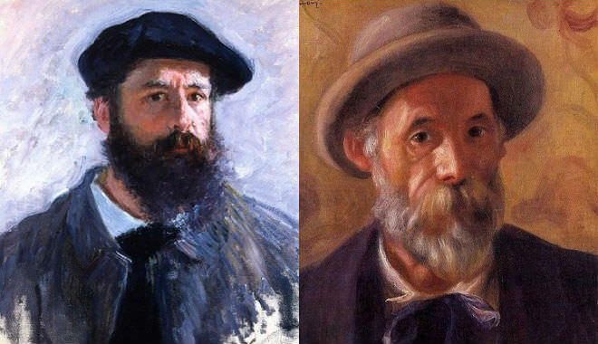
Monet and Renoir, two renowned French Impressionist painters, ​were contemporaries and close friends, sharing a common artistic movement but expressing their creativity through distinct painting techniques. While both artists sought to capture the fleeting effects of light and atmosphere in their works, they approached their subjects with unique styles and perspectives. Let's explore the painting techniques of Monet and Renoir, highlighting their similarities and differences.
Picture
Claude Monet and Pierre-Auguste Renoir
Claude Monet, often regarded as the master of Impressionism, had a fascination with the interplay of light and color. His technique emphasized capturing the essence of a scene through loose brushstrokes and vibrant hues. Monet's paintings often featured spontaneous, broken brushwork that conveyed the ever-changing nature of light and its effects on the environment. He painted en plein air, working directly from nature, which allowed him to observe and depict the shifting colors and atmospheric conditions.
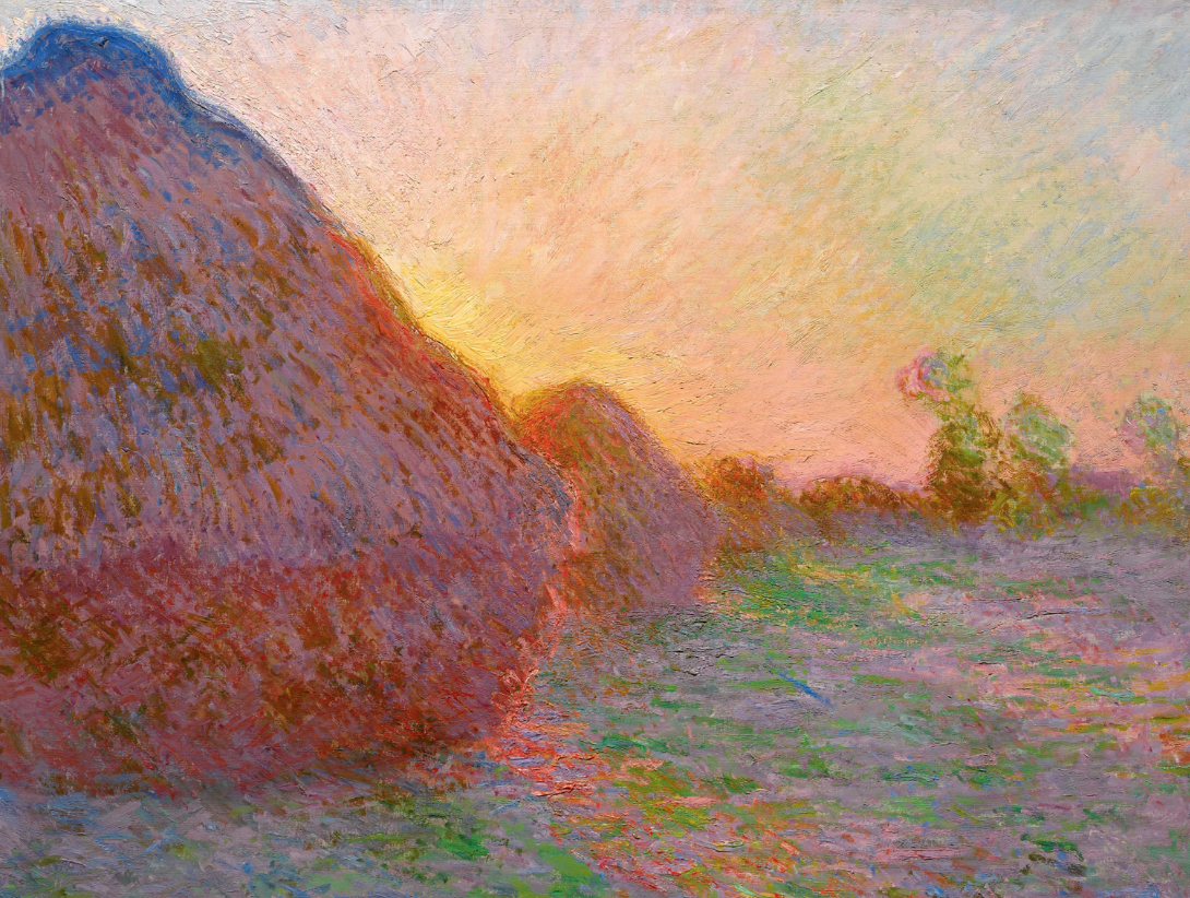
Monet's "Haystacks" and "Water Lilies" series exemplify his innovative techniques. In the "Haystacks" series, he painted numerous haystacks at different times of the day to study the variations in light and shadow. By employing rapid brushwork and layering complementary colors, he created an optical mixture that gave the impression of luminosity and movement. Similarly, his "Water Lilies" series explored the play of light on water, utilizing short, dappled brushstrokes to capture the reflections and the transient qualities of the scene.
Picture
Monet "Haystacks"
Claude Monet, often regarded as the master of Impressionism, ​had a fascination with the interplay of light and color. His technique emphasized capturing the essence of a scene through loose brushstrokes and vibrant hues. Monet's paintings often featured spontaneous, broken brushwork that conveyed the ever-changing nature of light and its effects on the environment. He painted en plein air, working directly from nature, which allowed him to observe and depict the shifting colors and atmospheric conditions.
Monet's "Haystacks" and "Water Lilies" series exemplify his innovative techniques. In the "Haystacks" series, he painted numerous haystacks at different times of the day to study the variations in light and shadow. By employing rapid brushwork and layering complementary colors, he created an optical mixture that gave the impression of luminosity and movement. Similarly, his "Water Lilies" series explored the play of light on water, utilizing short, dappled brushstrokes to capture the reflections and the transient qualities of the scene.
Picture
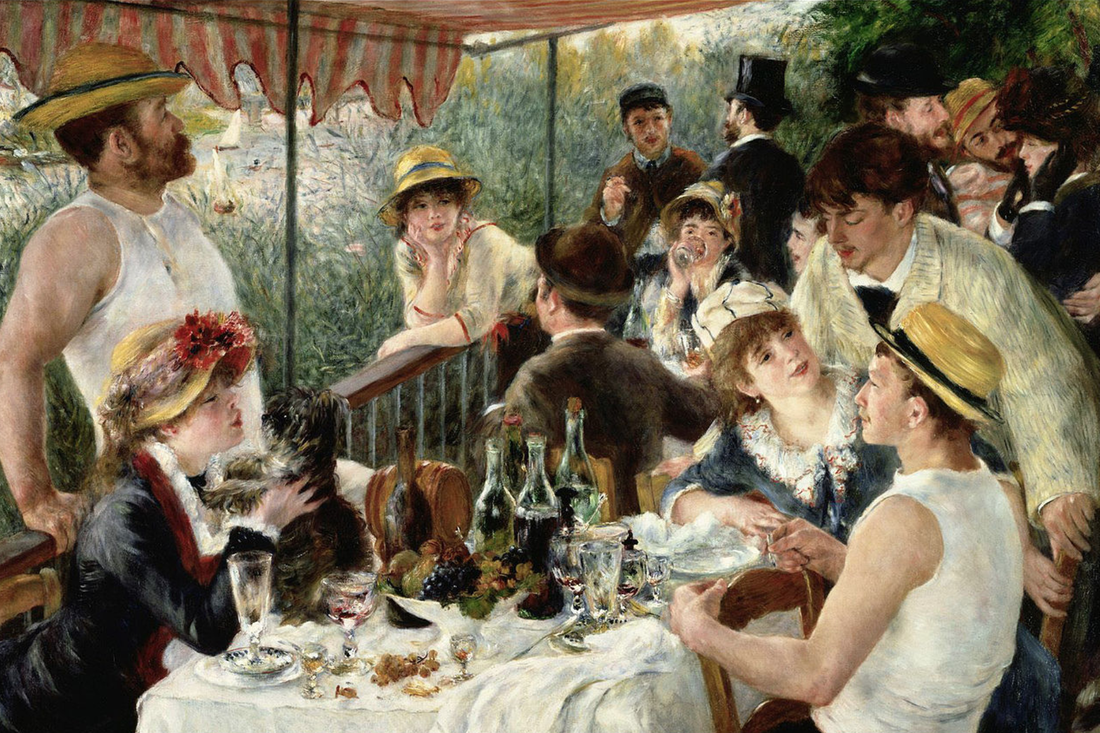
"Luncheon of the Boating Party"
On the other hand, Pierre-Auguste Renoir embraced a more classical approach to painting. His technique was characterized by a smooth, blended application of paint, producing a soft and sensual effect. Renoir's brushwork was less fragmented compared to Monet's, favoring a more refined and polished finish. His works often featured rich colors, delicate tonal transitions, and a focus on human subjects and their relationships.

Renoir's mastery of portraiture is evident in his iconic works such as "Luncheon of the Boating Party" and "Dance at Le Moulin de la Galette." In these paintings, he skillfully rendered the human form and captured the nuances of light and shadow. Renoir's brushwork was more controlled and precise, lending a sense of harmony and elegance to his compositions. His use of warm and glowing colors created a vibrant and lively atmosphere, inviting viewers into the scenes he depicted.


Despite their contrasting techniques, Monet and Renoir shared a common goal of capturing the transient qualities of light and atmosphere. They both rejected the academic conventions of their time, opting for a more spontaneous and direct approach to painting. Both artists aimed to depict the fleeting impressions of a moment and convey a sense of immediacy in their works.
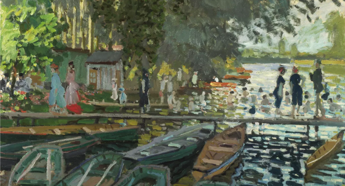
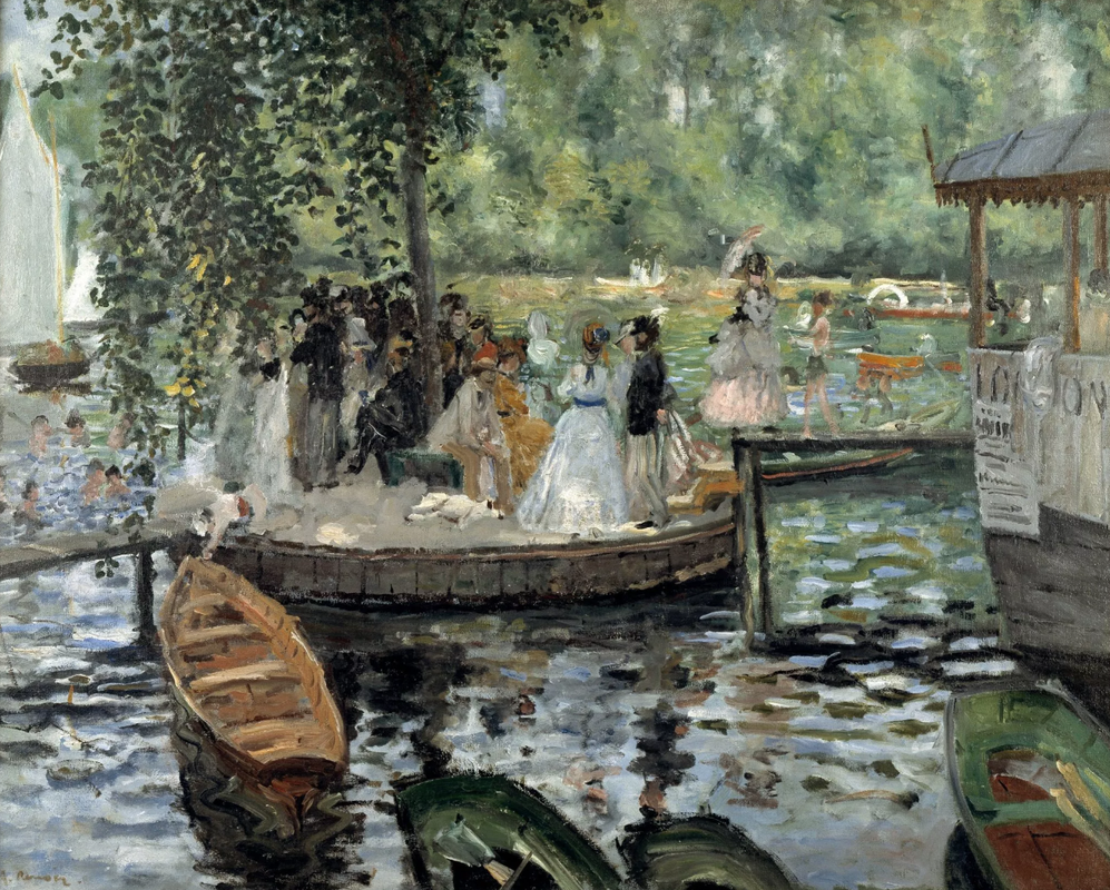
Monet and Renoir sometimes painted in the same spot together
Picture
"Bathers at La Grenouillère" by Claude-Oscar Monet, 1869
Picture
"La Grenouillère" by Auguste Renoir, 1869
Moreover, Monet and Renoir frequently painted alongside each other, exchanging ideas and influencing one another. They shared a passion for exploring the effects of light on different subjects, be it landscapes, seascapes, or human figures. Their close friendship and collaborative spirit undoubtedly contributed to the evolution of their respective techniques.

Monet and Renoir, while belonging to the same artistic movement of Impressionism, developed distinct painting techniques that set them apart. Monet's loose brushwork and emphasis on capturing the effects of light and color through broken strokes defined his style. Renoir, on the other hand, favored a more refined and polished approach, utilizing blended brushwork and warm colors to depict human subjects and their environments. Despite their differences, both artists revolutionized the art world with their innovative techniques and continue to inspire generations of painters with their unique visions.
1 Comment

    Author

    Patrick Howe

    Archives

    September 2026
    August 2026
    July 2026
    June 2026
    May 2026
    April 2026
    January 2026
    December 2025
    November 2025
    October 2025
    August 2025
    July 2025
    June 2025
    May 2025
    April 2025
    March 2025
    February 2025
    January 2025
    December 2024
    November 2024
    October 2024
    September 2024
    August 2024
    July 2024
    June 2024
    May 2024
    April 2024
    October 2023
    July 2023
    June 2023
    May 2023
    April 2023
    June 2022
    May 2022
    April 2022
    February 2022
    January 2022
    August 2020
    July 2020

    Categories

    All
    Abstract Vs Realism
    AI And Art
    All Cats
    Art And Music
    Art Galleries
    Art History
    Artist Patrick Howe
    Charcoal Drawing
    Color Mixing
    Color Theory
    Composition
    Copyright Law
    Creative Blocks
    Deep Space Flat Planes
    Easels
    Faces And Portraits
    Famous Artist Quotes
    Fear Of Failure
    FedEx Office And Print
    Floater Frame
    Hang And Display Art
    Hilma Af Klint
    History And Theory
    How To Study Paintings
    Impressionism
    Interesting Art
    John Singer Sargent
    Luminism
    Making A Wall Label
    Mediums
    Mickey Culver
    Mount Canvas To Board
    Oil Paint On Gold Leaf
    Paining On Board
    Painting Cats
    Painting Hacks
    Painting Techniques
    Painting Water
    Photographing Artwork
    Picture Frames
    Plein Air Painting
    Portrait Painting
    Preparing To Paint
    Print Reference Photo
    Psychology Of Art
    Quirky And Beautiful Paintings
    Recent Paintings
    Sfiumato
    Still Life
    Stretching Canvas
    Surrealism
    Technical
    Tonalism
    Weekly Art Beat
    Your Artistic Vision

    RSS Feed

Picture
Copyright © 2025, by Patrick Howe, all rights reserved.
Patrick Howe, Artist, Author and Educator
Seattle, WA.
Contact: [email protected]
  • HOME
  • Oil painting classes
    • LIVE CLASSES SEATTLE
    • OIL PAINTING SUPPLIES
    • ENDORSEMENTS
    • ABOUT CLASSES/ REVIEWS
    • OPEN STUDIO
    • GUARANTEE & TERMS
  • PORTFOLIOS
  • RESUME
  • STORE
  • FOR STUDENTS
    • RESOUCE CENTER
    • STUDENT SAMPLES
    • Free Pear Painting Exercise
    • Buying the Right Easel
  • BLOG
  • Contact / Sign up
  • MUSIC
  • BOOKS
  • Tuesday Art Things
    • Introduction Video
    • TAT 10/24/23
  • Thank you
  • Plein Air Painting
  • Photo Portfolio