  Oil painting by artist Mickey Culver [email protected]
Culver's painting blends realism and abstraction, offering a unique visual experience. The foreground stripes make us respond to the piece as if it were abstract. The abstract effect is accentuated by the seemingly disconnected landscape to the left and right of the vehicle in the upper part of the painting. However abstract this painting may seem, it is actually a realistic painting. It is an illusion on a highway. A mirage in which shimmering pools of water seem to cover the roadway far ahead. This mirage occurs when the air near the ground is much hotter than the air above it. This temperature gradient causes light rays to bend (refract) as they pass through layers of air at different temperatures, creating the appearance of water or a shimmering, blurry effect on the road. This is specifically called an 'inferior mirage', as the mirage appears below the actual object. As artists, this painting may inspire us to look for unusual phenomena in the world around us that would create a dynamic and thought-provoking composition, challenge viewers' perceptions, and invite diverse interpretations.
0 Comments
 Visual Color Memory Before I discuss the chart below, let's discuss visual color memory. Being able to create the exact color you want for a painting is a wonderful challenge and good skill to have. The first step is to know what colors you already have. And by "knowing" your color, I am saying can you see them in your mind without looking at them physically? You can probably see in your mind the difference between blue and red. But can you envision the more subtle difference between Cadmium Red Medium and Cadmium Red Light? When you look at the colors on your pallet, look at them with the intention of remembering what they look like. There's nothing special you have to do, just give the colors your attention for a moment and you will be committing them to your visual memory. Make Your Own Color Chart It can be helpful to make your own chart that has the colors you own. Next to each square of color, have the same color with some white added. That way you will see the pure color plus each color as a tint. Do this with each new color you buy to increase your visual vocabulary, and soon you will easily see in your mind, for example, the difference between Ultramarine Blue and Phthalo Blue. Or between Quinacridone Red and Quinacridone Magenta. The Color Mixing Guide The chart below (brought to my attention by one of the painters in my program) can help you, if you are new to color mixing. It shows all of the basic colors and what they look like mixed with each other. I found this chart to be very useful for my students. However, I must add one caveat. While the color mixtures are accurate on the chart, what the chart does not tell you is that there is a little bit of white added into each mixture of color. Nevertheless, I am recommending this chart as a very useful color matching aid. I believe it will help you on your journey to master full color matching. Where to Buy I found this chart on Blick Materials website for around $14. There are other cheaper charts that look similar, but they don’t have the same level of detail as this one.   Your Painting and Copyright Law
In my studio, I sometimes provide reference photos of paintings by other artists. But the images I provide are intended for educational purposes only. And copies painted of them are not meant to be sold or presented as your original works. Can you paint a picture of another person’s painting? Yes, but you cannot sell the painting. Or promote it in public/online as if it were your original idea. Can you post your copied painting publicly online? Yes, but: 1. You cannot offer it for sale. 2. You cannot sign it as if it were your original painting. 3. You must attribute the painting to the original artist and provide a link to the artist, if you know who it is. For example, you would specify in your post: “This is a study of a painting by Joe Smith at www.JoeSmith. com” If you want to be extra courteous, contact Joe Smith first and ask him if you can paint a copy of his painting. If you are unaware of who the artist is, you could do a Google image search. And if you still cannot find who the artist is, then state in your post: "Image found on line, artist unknown." Can you share images of your copied painting with friends? Yes, but technically, you cannot sell it to them. Can you give your copied painting away? Yes. However, best practices would suggest that you credit the original artist, if you know who it is, on the back of the painting along with all the other important details of the piece, like the title, dimensions, and medium. Can you paint a painting that is a dramatically altered version of another painter's painting? Yes, if it is altered sufficiently. The criteria is that if you paint an alteration of say Joe Smith's painting, it shouldn’t look like any specific painting by Joe Smith. This is a gray area in copyright law, so I can’t say exactly how altered it must be from the original. Can you paint in another artist's style? Yes, an artist cannot own a style. Artists can only own specific physical or digital works. In other words, you could paint in Van Gogh’s style all you want and sign it as your own, but you could not paint a copy of any specific Van Gogh paintings and claim it as your own. Are there copyright-free images to use as reference photos? Yes, do a search for copyright-free photos and lots of options will come up. Can you use AI-generated images as reference photos, which are cobbled together images of other artists artwork? This is a new topic, and precise rulings have not been made yet about copyright ethics and AI-generated images.  There is no universal standard for what a wall label should look like, or the information that it should contain. Art galleries and museums will have their own stylistic preferences. However, here is what a typical wall label may look like if you are making your own: Label dimensions: 3” horizontal by 2” vertical Font: New Time Roman, or Arial, or Aptos Font size: 11 point  Here are the items your wall label must contain:
Title: Artist: Dimensions: Medium: Price: Contact info: About the Title If your painting is from your own reference photo, then you can title it whatever you wish. However, if your painting is a copy of someone else's painting that was found online, then it is not an entirely original work of yours because you are copying somebody else's work. In that case, your title should say: "This is a copy of a painting found online, artist unknown.” If you do know who the original artist is, then for the title you would say: "This is a copy of a [Artist name here] painting" Dimensions Indicate the width first. The dimension is for the artwork only and does not include the frame. Medium Oil on canvas. Or Oil on board. Or whatever the medium is. Price You can have any price you want. There is no universal standard. But naturally, if you are new to painting you would price your work on the lower side. If your painting is a copy of another artist’s work, you must put ‘NFS’ for the price. Because it is unethical to sell a painting that is a copy of another artist work. NFS means Not For Sale. Your Contact Information If you would like to be contacted about questions or for a possible sale, you must put your email address on the label. However, if you do not want to make your email address public then do not put it on the wall label. Printing Your Wall Label After printing your wall labels, draw a 2" x 3" box around it, then carefully cut it out with a blade or scissors. Make sure the cut lines are straight and cut carefully. You want your label to look professional. Back of Painting Information All of the information on your wall label, except for price, must also be permanently applied to the back of your painting. That way, people hanging your artwork can associate the information on your wall label with its specific painting. Do not use a felt tip pen to write on the back of a canvas because, over time, it may leach through to the front of the painting. I typically use a soft lead pencil. Write legibly, clearly, and dark enough so no one has to struggle to read it. The price is never included on the back of your painting because it can change.  Painting from a Photo on Your Device Pros: Your reference photo is handy, right there on your device, and it looks so colorful! Cons: You will never be able to match the colors on a backlit screen. Your device makes the colors more brilliant and saturated, which is a radically different color environment than a printout. But a good hard copy printout is far closer to what your painting will eventually look like than on a backlit device. So if you want color and value accuracy, then a printout is better. Below left: Device shows bright colors. Right: A printout is not as colorful but its colors will be truer to what you can achieve with paint.  Why is it difficult to get a good quality printout from my printer at home? 1. Because most printers are not designed for high-quality printing. 2. Because you're using regular copy paper which will never, ever, produce a good-quality reference photo. Below left: Regular copy paper. Right: High quality copy paper.  Furthermore, you need a high-quality printer to produce high-quality prints. I have a Canon Pixma Pro 100 (around $600). It is outstanding, but I do no recommend getting one unless you are printing lots of professional high-quality photos. Instead, get your prints from FedEx Office and Print. High-Quality Prints from FedEx Office and PrintBy request: Here are instructions for getting good-quality prints from FedEx Office and Print. Step 1: Go to FedEx Office and Print: https://www.office.fedex.com/#!upload/multiple/pid%3D1456773326927/false Select: Copies & Custom Documents    Next page:  Next page:  Scroll down to select a FedEx Office and Print location:  Scroll down to contact information:  Once you make your purchase, you will receive a notice from FedEx Office and Print that they have begun your order. Then later, usually within 24 hours, you will receive a notice that your order is finished and ready for pick up.
 See this six minute canvas mounting video. Here are the supplies you will need to mount a loose canvas painting onto board. 1. Your 8” x 10” painting on loose canvas. 2. One 8” x 10” Hardboard Panel for mounting--Or one 8” x 10” cradled board for mounting. (See picture below). The hardboard panel, or the cradled board, do not need to be primed. Just get plain wood. 3. The smallest container of YES Paste that they sell.--Or, the smallest bottle of PVA Size. YES Paste and PVA Size do the same thing. 4. Paper. You will be placing your painting face-down on the table, so if you want to protect it, bring some paper, Or plastic, to place under Face down painting. 5. A sharp utility blade or X-Acto knife. 6. If you have a brayer, bring it. If not, we can press the painting down against the board with the palm of our hands. (If you don't have a brayer, don't buy one just for this one exercise). This is an experiment, so it may be best if you can buy just one hardboard panel or cradleboard to see how it goes for you. If you buy online, you may have to buy a large quantity. I don't think you can buy just one online. But you can buy a single item at a brick-and-mortar store such as Artist and Craftsman, or Blick Materials (or wherever you shop for your brick-and-mortar supplies). It's always good to call the retailer first to make sure they have these items in stock before leveling to the store. (Do not get the kind of board that is already covered with canvas). (Do not get Ampersand Gessobord. It's a high-quality board with a beautifully prepared surface. But it's more expensive and unnecessary for this experiment).  At left: Single pieces of hardboard. At right: the backside of a cradle board.  Smallest container of YES Paste, or the smallest container of Gamblin PVA Size. They both do the same thing.  Brayer (if you already have one it would be handy, but not required) Review this blog post on mounting loose canvas on board.  One of the painters in my program, Amanda Baumgartner, recently finished this painting of a dramatic cloud and reflections in water.  Please check out Amanda's Instagram video of her in the process of painting: https://www.instagram.com/p/C8CsyGjJmjS/ Painting pictures of the sea in oils is both challenging and rewarding. Capturing the dynamic movement of waves, the play of light on water, and the vastness of bodies of water requires skill and patience. The challenges include rendering realistic textures and achieving the right balance of colors to depict depth and motion. The rewards come in the form of creating a scene that evokes the power and beauty of the sea, and offers viewers a sense of tranquility and awe. Famous sea painters include J.M.W. Turner, whose dramatic seascapes are legendary, and Winslow Homer, known for his realistic and evocative marine scenes.  "Breezing Up (A Fair Wind)" by Winslow Homer was painted between 1873 and 1876  J.M.W. Turner- "The Fighting Temeraire Tugged to Her Last Berth to Be Broken Up", 1838
Oil Painting on Gold Leaf: A Fusion of Metallic Reflection with Opaque and Glazed oil Paint6/3/2024
 Gustav Klimt created his gold leaf paintings primarily during his "Golden Phase," which spanned from the late 1890s to the early 1910s. This period is characterized by his extensive use of gold leaf, inspired by Byzantine mosaics and the Art Nouveau movement. Oil painting on gold leaf is a technique that marries the luminous quality of gold with the rich texture of oil paints. The process begins by applying thin sheets of gold leaf to a prepared surface, using an adhesive called ‘size’ to ensure it adheres smoothly. Once the gold is set, artists paint over it with oil paints, often using glazed layers to allow the gold to shimmer through. This method creates a striking visual effect, enhancing the depth and brilliance of the artwork. Historically used in religious iconography and fine art.  Gustav Klimt. Noticed the scale of this piece compared to the stairs on the left, it's quite large  Stephanie Rew https://www.stephanierew.co.uk/  Harmony in Blue and Gold: The Peacock Room; James McNeill Whistler (1834–1903); 1876–77; oil paint and gold leaf on canvas, leather, and wood.  Chinese Women and Children in a Palace Garden - screen, formerly attributed to Kano Eitoku
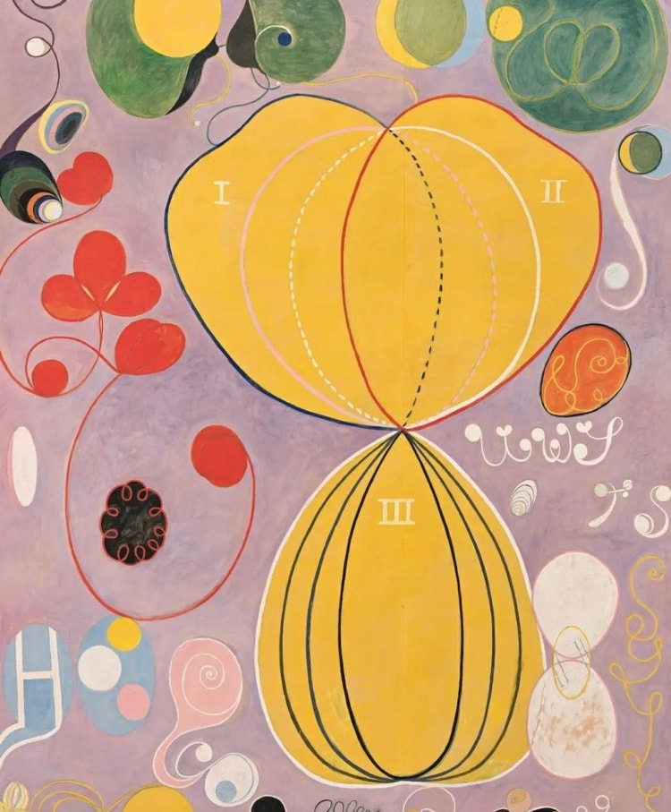
While I do not teach gold leaf techniques in my studio at the Phinney Center in Seattle, if you are interested in experimenting with gold leaf techniques, there are many informative instructional videos on YouTube.  Hilma af Klint (1862-1944) was a pioneering Swedish artist and mystic, recognized as a forerunner of abstract art.
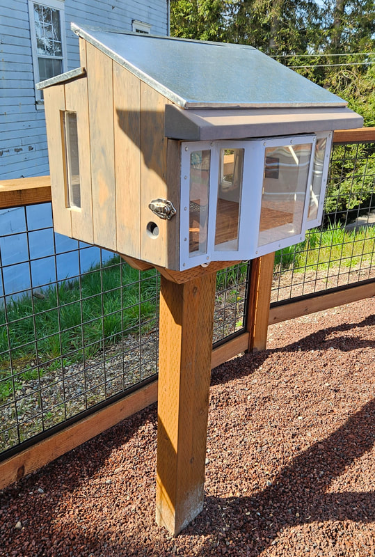
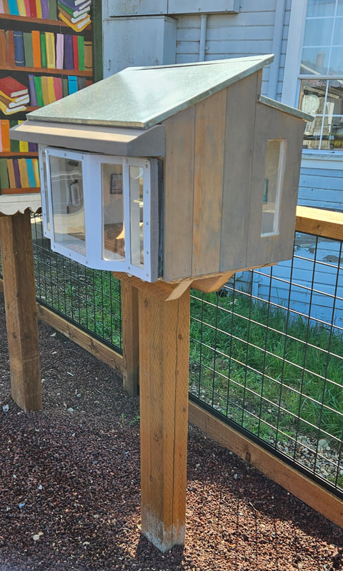
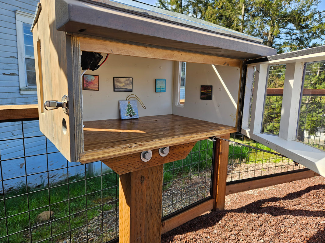
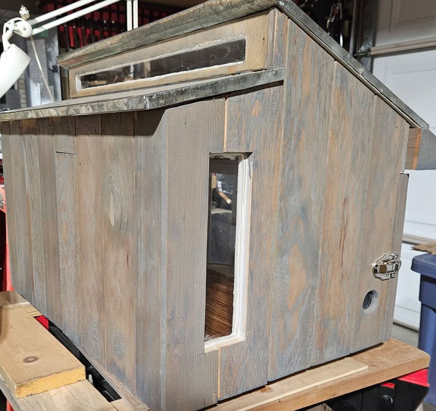
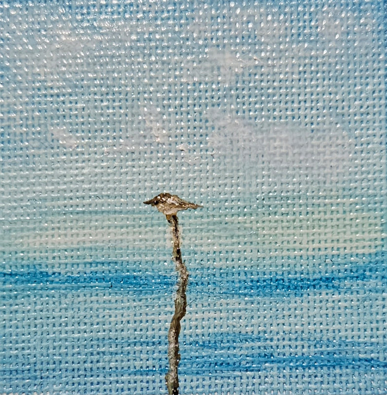
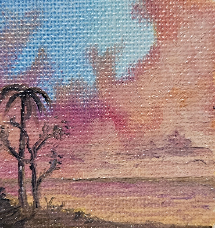
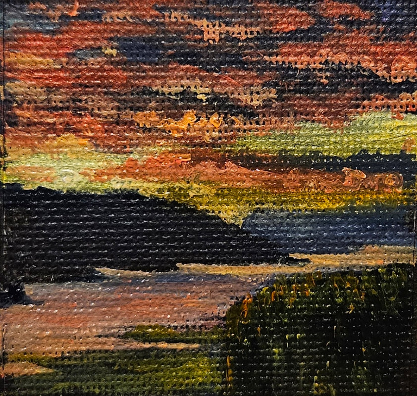
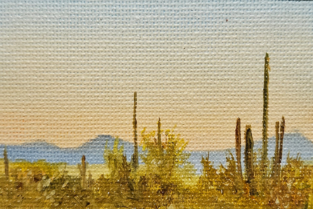
She hid her artwork for 20 years because she thought the world was not ready for her vision. And then when her work was finally exhibited after her death, the art world discovered that she had been exploring abstract concepts in art long before her famous male counterparts. I enjoy these kind of disruptions. Her works were expired by spiritualism, Theosophy, Anthroposophy (a blend of spirituality, science, architecture, and art) and her own mystical experiences. Klint's abstract paintings, characterized by bold colors, geometric shapes, and esoteric symbolism, were largely unknown during her lifetime and remained hidden for years. Her unique artistic vision and innovative approach have gained significant recognition posthumously, positioning her as a groundbreaking figure in modern art history, who challenged traditional artistic norms and opened new pathways for abstract expression. Artist Mickey Culver built this amazing functional miniature art gallery that is displayed outdoor in Black Diamond, at 32627 Railroad Ave, Black Diamond Wa. Artworks are only one or two inches square. The front of the gallery opens up so you can see the paintings inside. And like the little free libraries you see around town, anyone can take one of the little painting in the gallery as long as you replace it with your own little painting. The walls are magnetic so just glue a little piece of metal, like a washer, to the back of your miniature artwork and it will attach to the wall. See photos below including a few of Mickey's miniature paintings. For more information, contact Mickey Culver at [email protected] 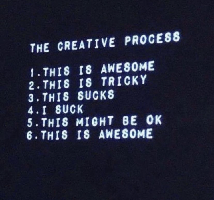 Creative blocks can be frustrating, but there are several strategies you can use to overcome them. Here are some tips to help you get your creative juices flowing:
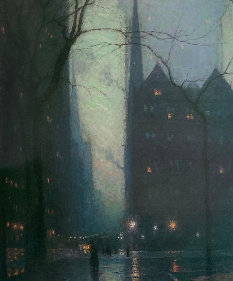
Confusion is normal. The creative process include Curiosity, Chaos, and Clarity. Curiosity inspires us to start painting our painting. Then comes Chaos, which is the mess in the middle of the painting. In the end is Clarity, when we see how it's all come together. Be comfortable in the Chaos, even seasoned pros have this experience. Take Breaks. Step away from your project for a while. Short breaks can help you recharge and return to your work with a fresh eye. Embrace Constraints. Limitations can often fuel creativity. Embrace the constraints you face and use them as a source of inspiration. Break Large Paintings into Smaller Ones. How do I manage paintings that are 5 feet by 5 feet, or larger? The answer is that I don’t. I learned long ago that when you’re painting, you’re really only looking at about 12 square inches at any time. So in the end, to paint a 5 by 5 foot painting, I paint 25 12” x 12” paintings. Divide you painting into convenient, bite-size tasks. It makes it much easier. Make sure you have everything you need. The right brush, the right colors, the right lighting, a comfortable chair or stool, room temperature, etc. Take the time to prepare the details of your circumstance to maximize your comfort and enjoyment. Try New Techniques or Tools In the middle of a large painting, take a break to enjoy a small painting exercise. Like doing a 5 inch by 5 inch palette knife painting in say about one hour. Or a painting using only your fingers (I have nitrile gloves). Get free and loose for awhile. Keep it sketchy. Stop taking it so seriously. Remember we’re explorers. Keep it curious and mysterious. Let go of performance anxiety. Come back into the present moment. It’s about the journey not the end product. The point of a dance is not to get to the end of the dance, it is to enjoy being in the dance. The goal of the musician is not to get to the end of the song. The goal of the artists is to be in the creative flow, and the artwork that comes out of that is a bonus. Stop competing with your self. Notice if there is a voice in your head telling you that you must do better than you’ve ever done before. Silence that voice. You’re an explorer, not a contestant. Errors, miss-steps and little so-called failures are normal. They are a sign that you are growing. It’s ok to be normal. Famous Quotes about Blocks and Inspiration “If it is a bigger creative block, I try to ride it out and just let it happen. I will still draw, but most pieces will end up in the trash, and that’s OK. I think some of the biggest bursts of creativity and artistic growth I’ve had are usually preceded by a big creative block.” — Ashley Goldberg “Inspiration exists, but it has to find us working.” — Pablo Picasso “Everyone is born creative; everyone is given a box of crayons in kindergarten. Then when you hit puberty they take the crayons away and replace them with dry, uninspiring books on algebra, history, etc. Being suddenly hit years later with the ‘creative bug’ is just a wee voice telling you, ‘I’d like my crayons back, please.” — Hugh MacLeod “The creativity for you is a place where no one else has ever been. You have to leave the city of your comfort and go into the wilderness of your intuition. What you’ll discover will be wonderful. What you’ll discover is yourself.” — Alan Alda The history of art throughout the world is vast. And the summary here of Western art history is a good starting point. This Link will take you to a very convenient chronological chart of western art history. And below are styles being explored by painters in my studio. 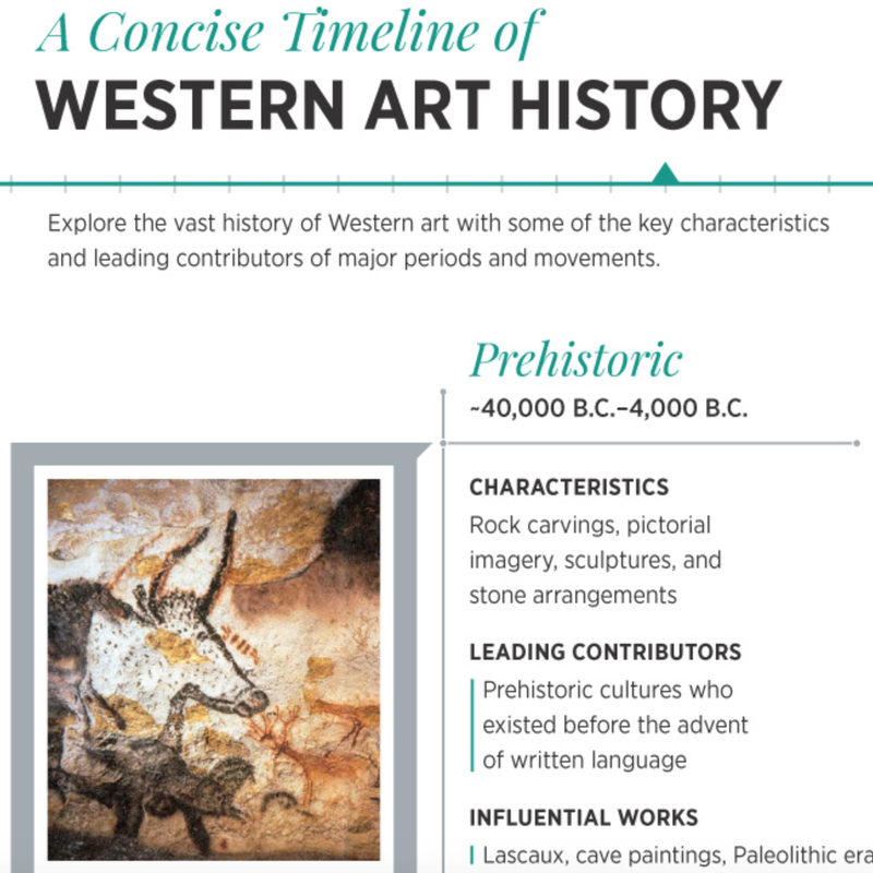 In my painting program... most painters are exploring Contemporary Realism, Impressionism, Tonalism, Luminism, and Surrealism. Here are samples of each from art history: Contemporary Realism The contemporary realism movement is a worldwide style of painting which came into existence in the 1960s and early 1970s. Featuring a straightforward approach to representation practiced by artists such as Philip Pearlstein, Alex Katz, Jack Beal and Neil Welliver. The movement refers to figurative art works created in a natural yet highly objective style. Today the term Contemporary Realism encompasses all post-1970 sculptors and painters whose discipline is representational art, where the object is to portray the "real" and not the “ideal". More about Contemporary Realism About Photorealism 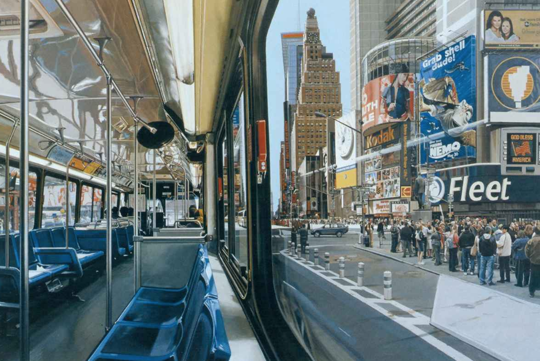 By Richard Estes Historical Origin of Realism The Realist movement began in the mid-19th century as a reaction to Romanticism and History painting. In favor of depictions of 'real' life, the Realist painters used common laborers, and ordinary people in ordinary surroundings engaged in real activities as subjects for their works. More about Realism 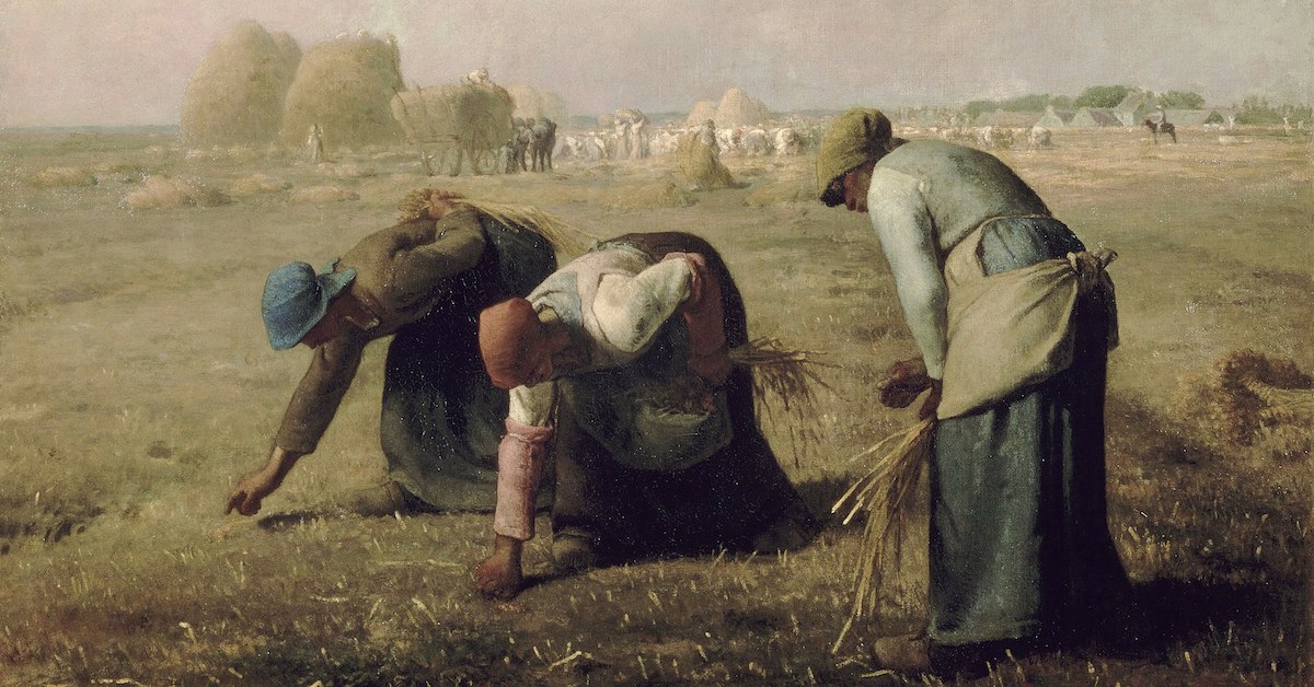 The Gleaners is an oil painting by Jean-François Millet completed in 1857. Impressionism Impressionism was a 19th-century art movement characterized by relatively small, thin, yet visible brush strokes, open composition, emphasis on accurate depiction of light in its changing qualities (often accentuating the effects of the passage of time), ordinary subject matter, unusual visual angles, and inclusion of movement as a crucial element of human perception and experience. Impressionism originated with a group of Paris-based artists whose independent exhibitions brought them to prominence during the 1870s and 1880s. More about Impressionism 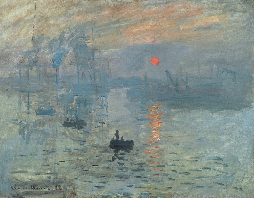 Impression, Sunrise is an 1872 painting by Claude Monet Tonalism Tonalism was an artistic style that emerged in the 1880s when American artists began to paint landscape forms with an overall tone of colored atmosphere or mist. Between 1880 and 1915, dark, neutral hues such as gray, brown or blue, often dominated compositions by artists associated with the style. During the late 1890s, American art critics began to use the term "tonal" to describe these works, as well as the lesser-known Two of the leading associated painters were George Inness and James McNeill Whistler. Overview of Tonalism 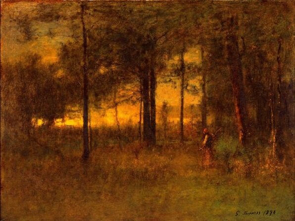 "Georgia Sunset" by George Inness Luminism Luminism is an American landscape painting style of the 1850s to 1870s, characterized by effects of light in landscape, through the use of aerial perspective and the concealment of visible brushstrokes. Luminism landscapes emphasize tranquility, and often depict calm, reflective water and a soft, hazy sky. Artists who were most central to the development of the luminist style include Fitz Hugh Lane, Martin Johnson Heade, Sanford Gifford, and John F. Kensett. More about Luminism 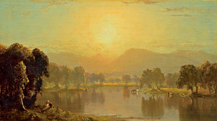 "Bend on the Juniata River" by Sanford Gifford Surrealism Surrealism aims to revolutionise human experience. It balances a rational vision of life with one that asserts the power of the unconscious and dreams. The movement's artists find magic and strange beauty in the unexpected and the uncanny, the disregarded and the unconventional. More about Surrealism 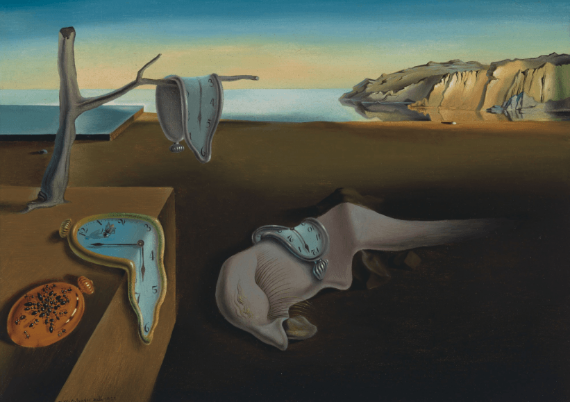 "The Persistence of Memory" 1931 Salvador Dali
Here I have simplified some of the issues relating to photographing your artwork with a camera phone. With these common sense suggestions you’ll be able to produce good-quality photos of your paintings. For the highest possible quality—if you intend to make prints, you will need to go to a professional art photographing service that specializes in photographing art. But a good phone camera can produce excellent images of your artwork for most digital representation. Here are some important tips to follow. Set you camera to the highest resolution. This will make the file larger, but you want a larger file for recording your paintings for display, reproduction, and posterity. On an iPhone you would select High Efficiency for the highest resolution. (Settings > Camera > Format > High Efficiency). 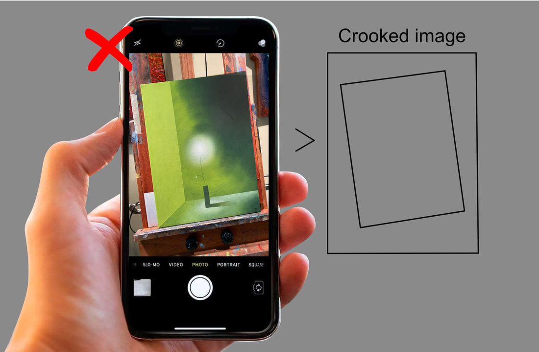 Avoid crooked image: When photographing your artwork, make sure you position your camera so that the painting is perfectly square on the screen. 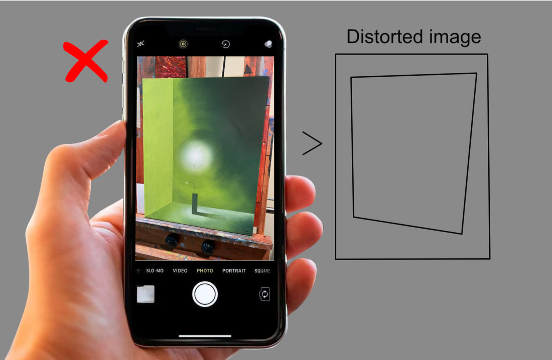 Avoid image distortion: Make sure your camera is perfectly parallel to your painting. 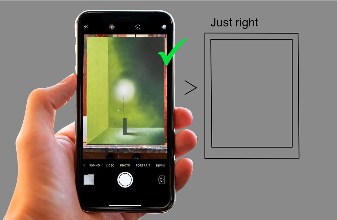 Correct orientation of your phone to your artwork. 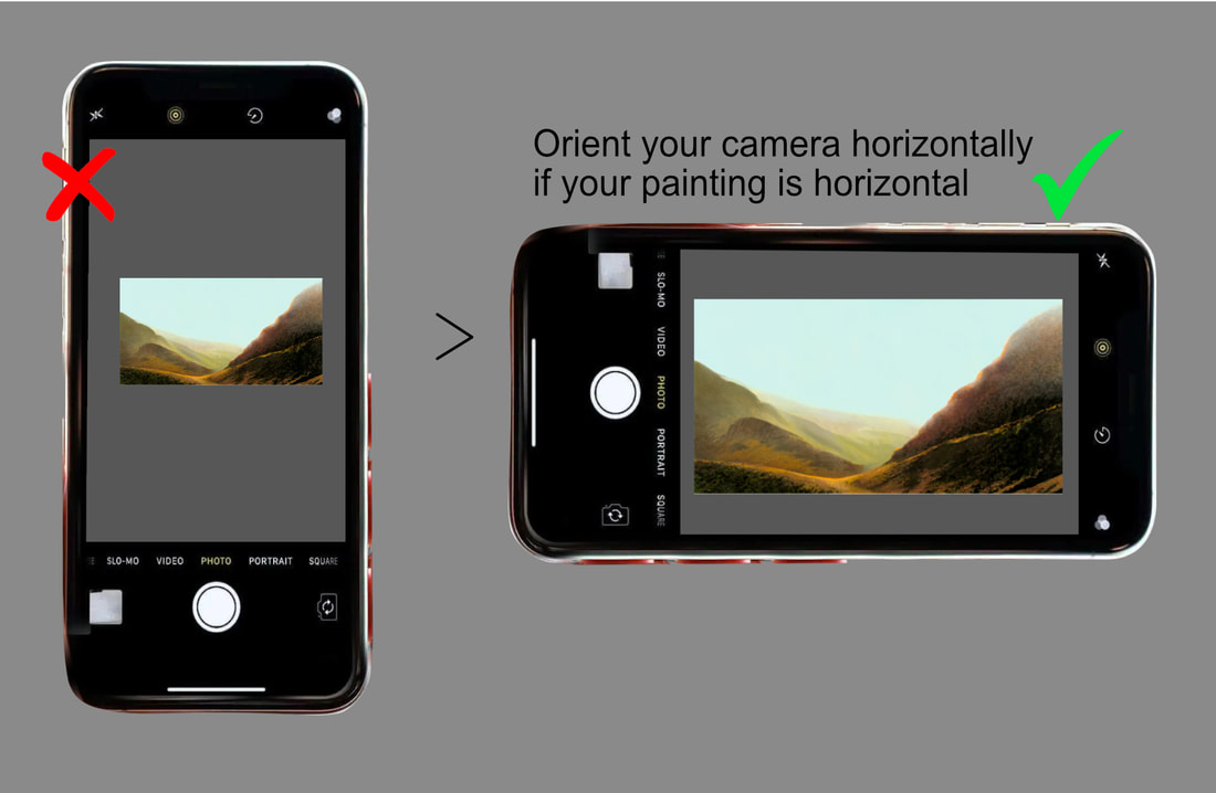 Camera orientation. We are used to holding our phone cameras vertically. But to get the largest possible image, and highest resolution. Always orient you camera so you are shooting the longest side of the screen with the longest side of the painting. You can rotate the image later with your camera's editing feature. 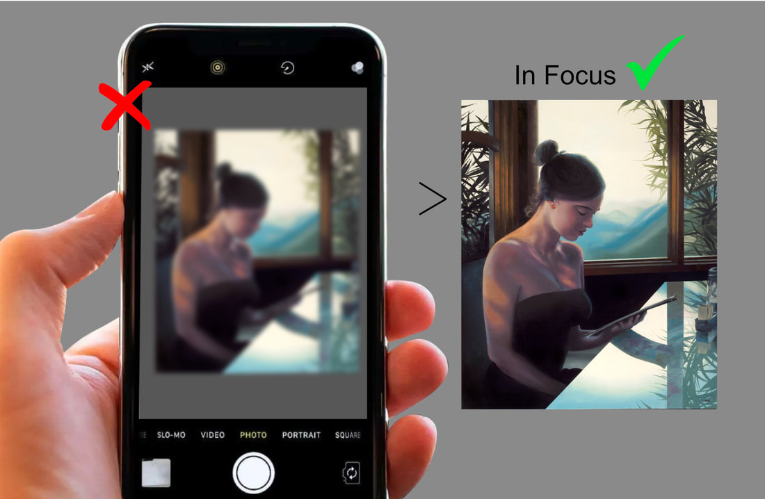 Phone cameras focus automatically. But sometimes, because a painting is flat, and not three-dimensional like the real world, the camera has difficulty focusing. Check to make sure your image is in focus. 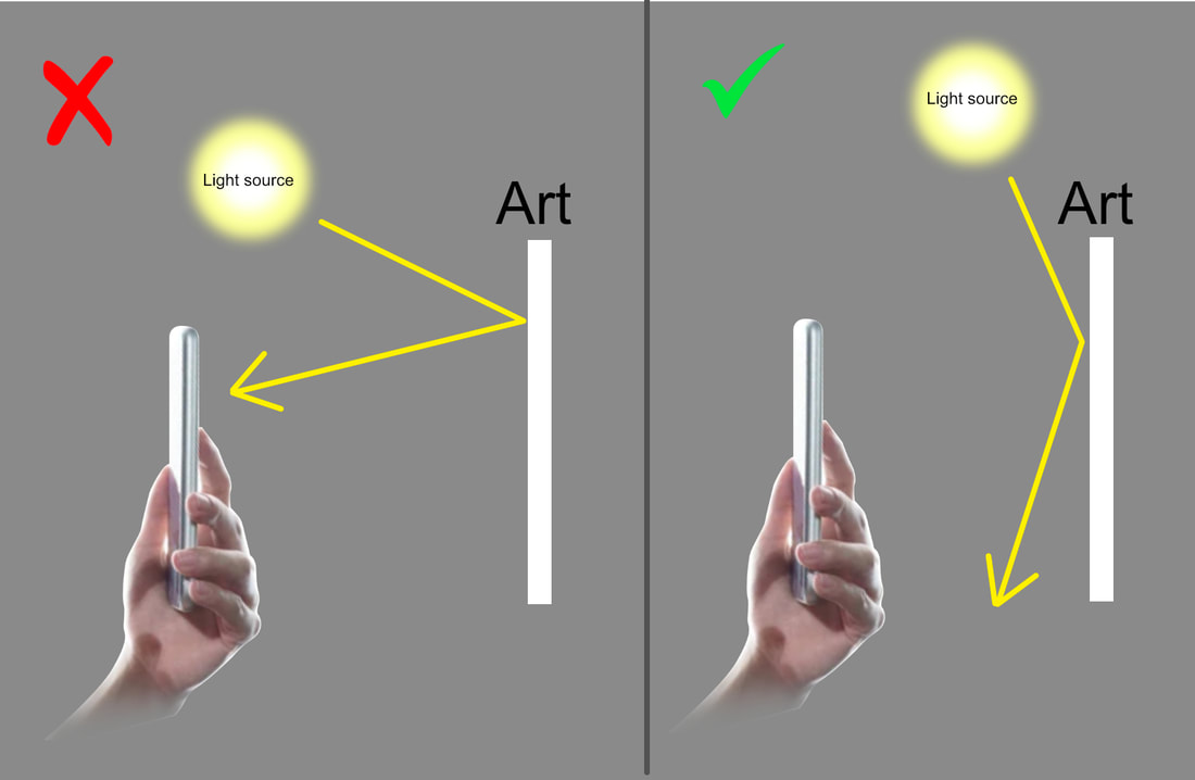 Avoid glare: Whether shooting your artwork indoor or outdoor, make sure you are not getting glare from any light source. 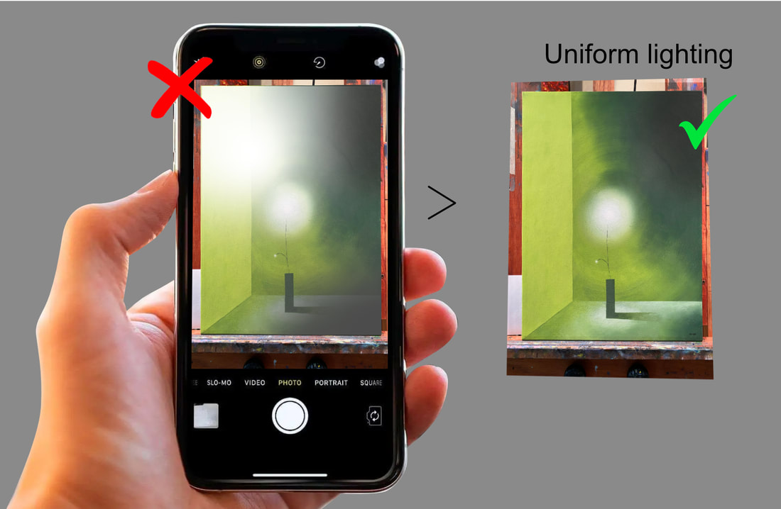 Uniform Lighting: Make sure the light is uniform on your artwork. No glare and no shadows. 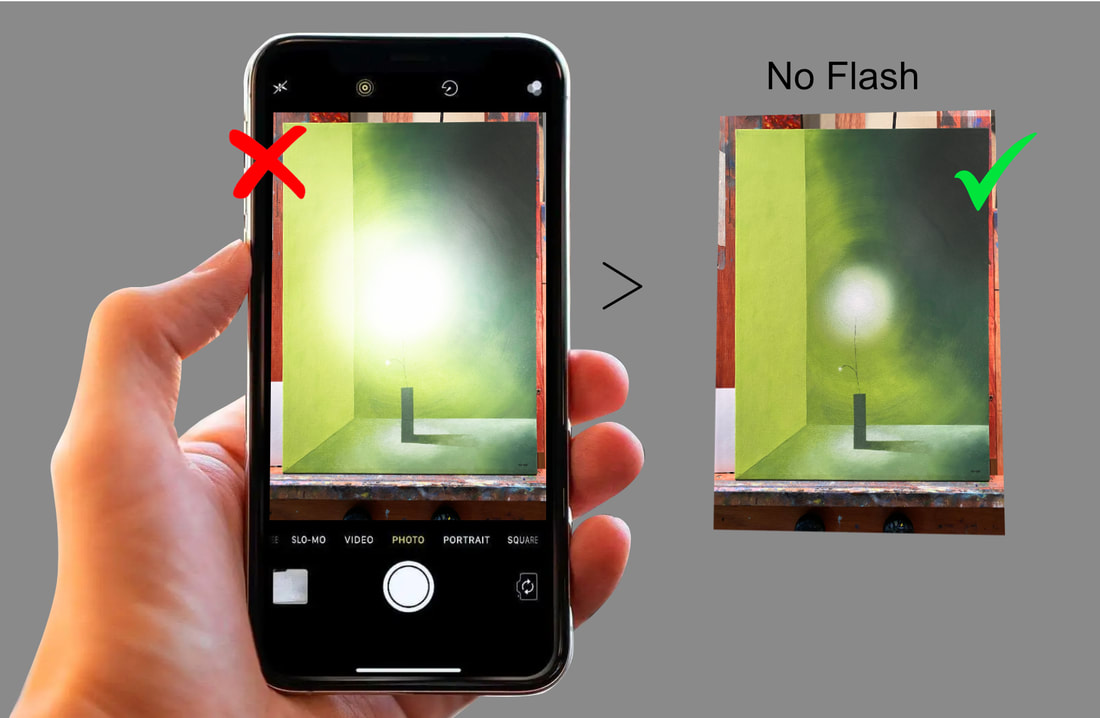 No flash! Turn the camera’s flash off. It will cause a glaring ‘hot’ spot in the middle of your painting. 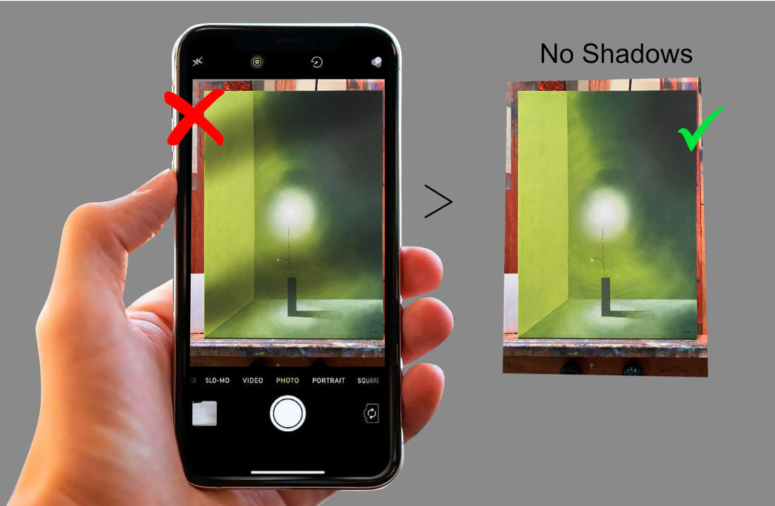 No shadows. Make sure no shadow are anywhere on the painting from the surrounding environment. 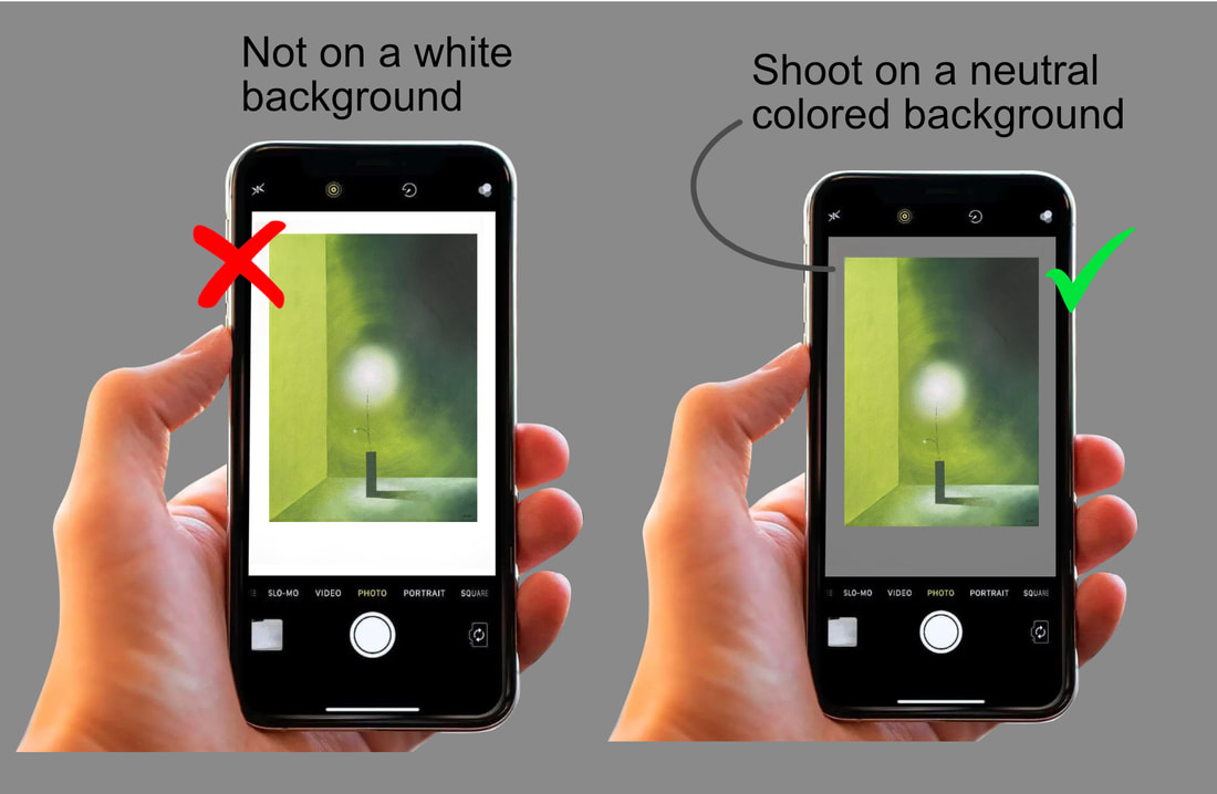 Shoot your painting on a neutral colored background. Don’t use white or any bright color. The reason is that if you have white all around your painting, the camera will ‘think’ the white is part of the painting and will include it in its overall color and value adjustment. Whereas a neutral color will tend to be “ignored”. 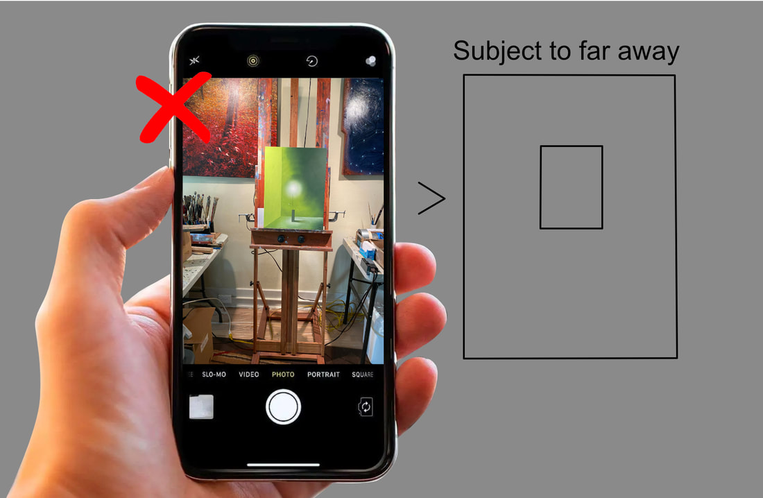 Don’t shoot from far away. You want the image as large as possible in the picture frame without cropping any part of the image. 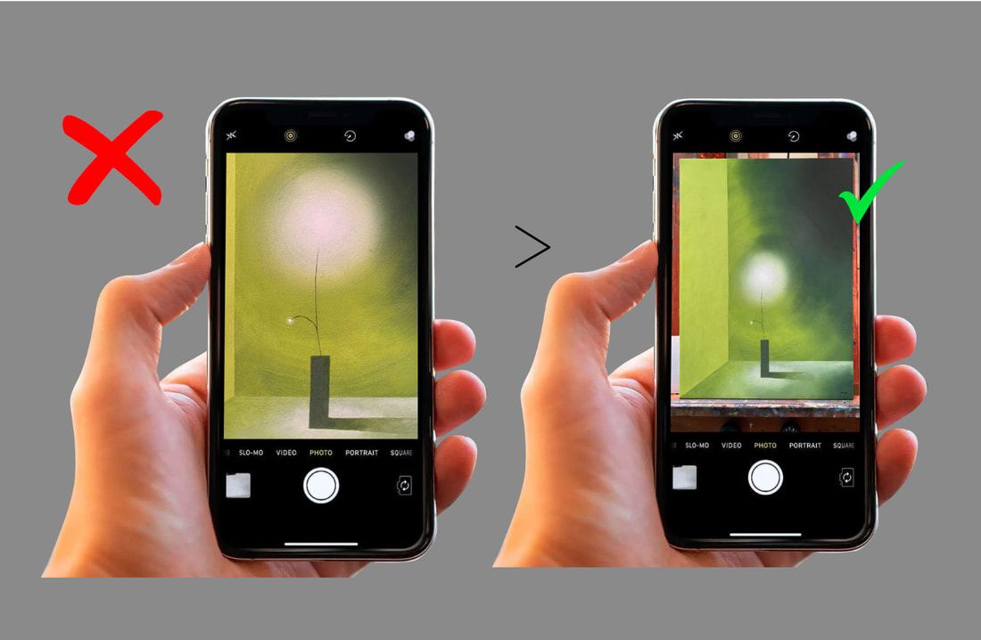 Don’t shoot too close. You always want a little of the surrounding background to show on the screen. That way you will know for sure your haven’t cropped out any of your painting. Then you can do a more precise crop with the camera's photo editing tools. 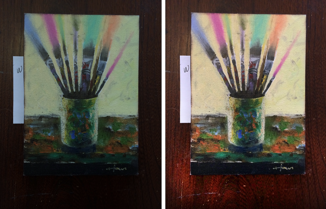 White Balance: Most cameras adjust White Balance automatically. When the camera sees white, it will automatically adjust all other colors to their proper color temperature. Temperature relates to an image's either cool cast or warm cast. White Balance is a perfect balance between cool and warm. But sometimes the camera doesn’t correct White Balance perfectly. I alway include a small piece of white paper next to my painting so I can check the White Balance after taking the photo. If the white is not perfectly white, then I can adjust it on my camera after taking the photo.
Monet and Renoir, two renowned French Impressionist painters, were contemporaries and close friends, sharing a common artistic movement but expressing their creativity through distinct painting techniques. While both artists sought to capture the fleeting effects of light and atmosphere in their works, they approached their subjects with unique styles and perspectives. Let's explore the painting techniques of Monet and Renoir, highlighting their similarities and differences. 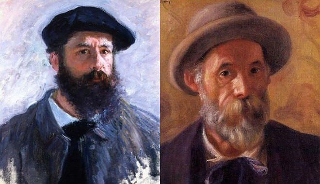 Claude Monet and Pierre-Auguste Renoir Claude Monet, often regarded as the master of Impressionism, had a fascination with the interplay of light and color. His technique emphasized capturing the essence of a scene through loose brushstrokes and vibrant hues. Monet's paintings often featured spontaneous, broken brushwork that conveyed the ever-changing nature of light and its effects on the environment. He painted en plein air, working directly from nature, which allowed him to observe and depict the shifting colors and atmospheric conditions. Monet's "Haystacks" and "Water Lilies" series exemplify his innovative techniques. In the "Haystacks" series, he painted numerous haystacks at different times of the day to study the variations in light and shadow. By employing rapid brushwork and layering complementary colors, he created an optical mixture that gave the impression of luminosity and movement. Similarly, his "Water Lilies" series explored the play of light on water, utilizing short, dappled brushstrokes to capture the reflections and the transient qualities of the scene. 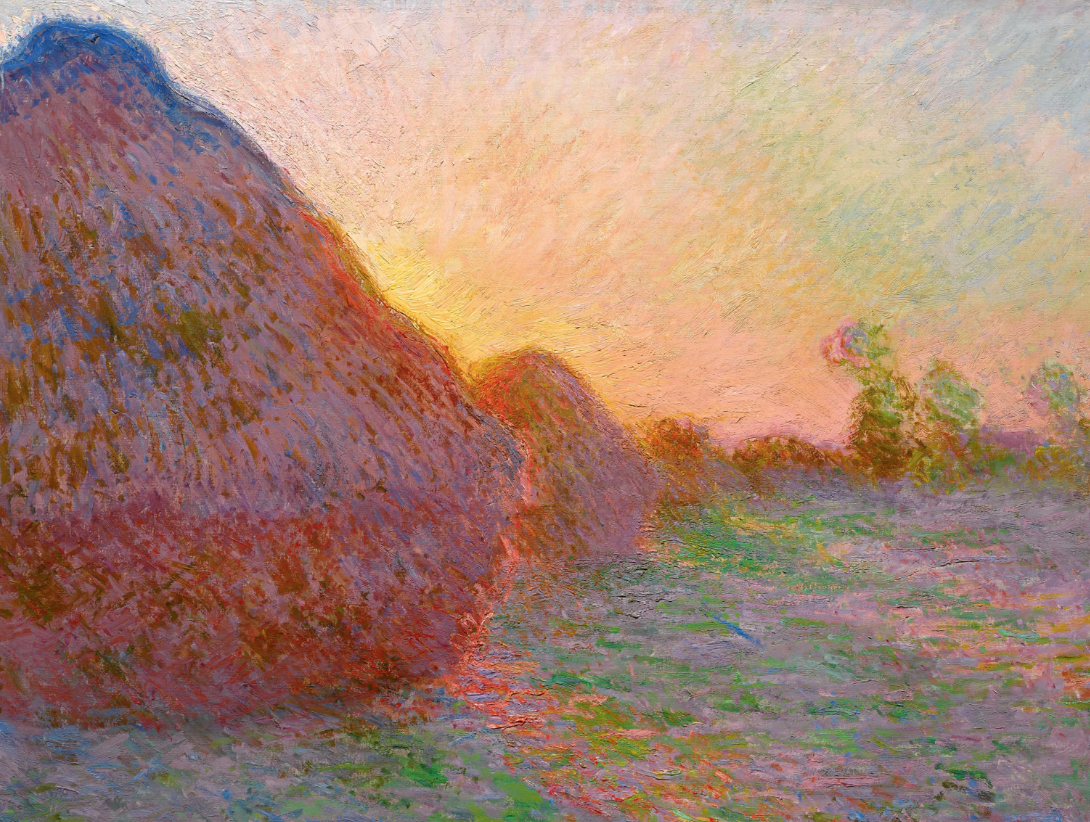 Monet "Haystacks" Claude Monet, often regarded as the master of Impressionism, had a fascination with the interplay of light and color. His technique emphasized capturing the essence of a scene through loose brushstrokes and vibrant hues. Monet's paintings often featured spontaneous, broken brushwork that conveyed the ever-changing nature of light and its effects on the environment. He painted en plein air, working directly from nature, which allowed him to observe and depict the shifting colors and atmospheric conditions. Monet's "Haystacks" and "Water Lilies" series exemplify his innovative techniques. In the "Haystacks" series, he painted numerous haystacks at different times of the day to study the variations in light and shadow. By employing rapid brushwork and layering complementary colors, he created an optical mixture that gave the impression of luminosity and movement. Similarly, his "Water Lilies" series explored the play of light on water, utilizing short, dappled brushstrokes to capture the reflections and the transient qualities of the scene. 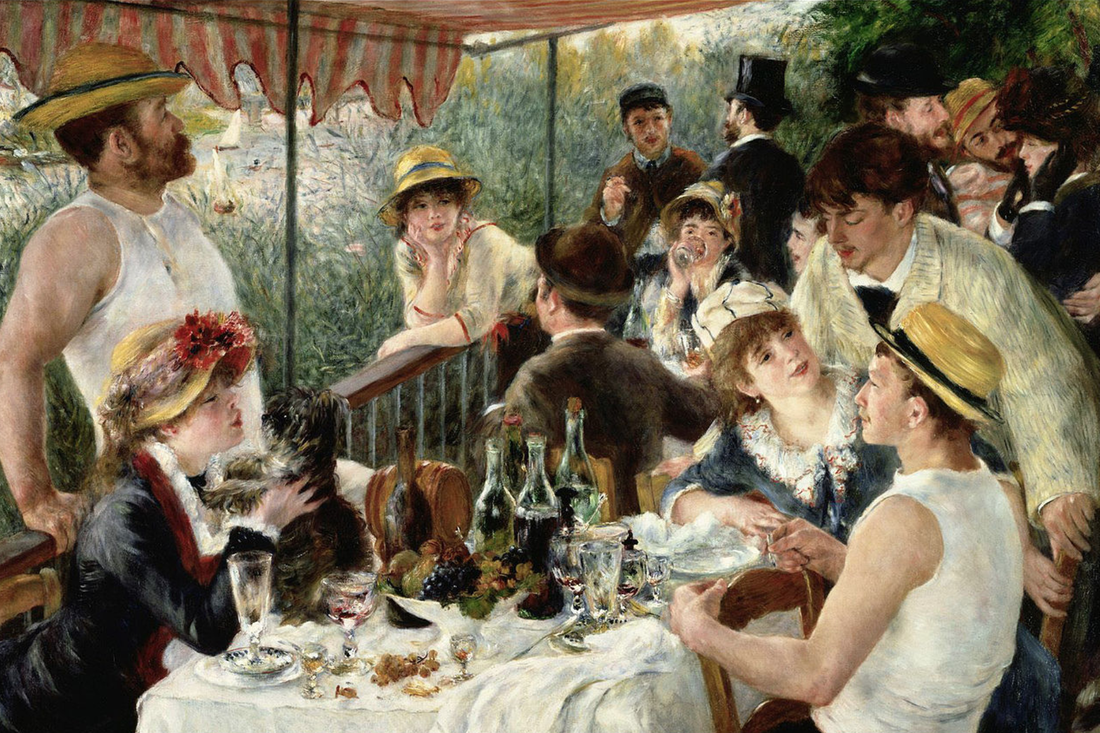 "Luncheon of the Boating Party" On the other hand, Pierre-Auguste Renoir embraced a more classical approach to painting. His technique was characterized by a smooth, blended application of paint, producing a soft and sensual effect. Renoir's brushwork was less fragmented compared to Monet's, favoring a more refined and polished finish. His works often featured rich colors, delicate tonal transitions, and a focus on human subjects and their relationships. Renoir's mastery of portraiture is evident in his iconic works such as "Luncheon of the Boating Party" and "Dance at Le Moulin de la Galette." In these paintings, he skillfully rendered the human form and captured the nuances of light and shadow. Renoir's brushwork was more controlled and precise, lending a sense of harmony and elegance to his compositions. His use of warm and glowing colors created a vibrant and lively atmosphere, inviting viewers into the scenes he depicted. Despite their contrasting techniques, Monet and Renoir shared a common goal of capturing the transient qualities of light and atmosphere. They both rejected the academic conventions of their time, opting for a more spontaneous and direct approach to painting. Both artists aimed to depict the fleeting impressions of a moment and convey a sense of immediacy in their works. Monet and Renoir sometimes painted in the same spot together 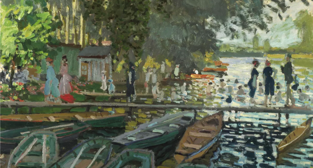 "Bathers at La Grenouillère" by Claude-Oscar Monet, 1869 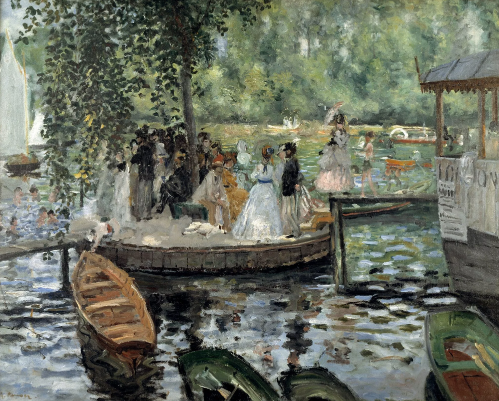 "La Grenouillère" by Auguste Renoir, 1869 Moreover, Monet and Renoir frequently painted alongside each other, exchanging ideas and influencing one another. They shared a passion for exploring the effects of light on different subjects, be it landscapes, seascapes, or human figures. Their close friendship and collaborative spirit undoubtedly contributed to the evolution of their respective techniques.
Monet and Renoir, while belonging to the same artistic movement of Impressionism, developed distinct painting techniques that set them apart. Monet's loose brushwork and emphasis on capturing the effects of light and color through broken strokes defined his style. Renoir, on the other hand, favored a more refined and polished approach, utilizing blended brushwork and warm colors to depict human subjects and their environments. Despite their differences, both artists revolutionized the art world with their innovative techniques and continue to inspire generations of painters with their unique visions. 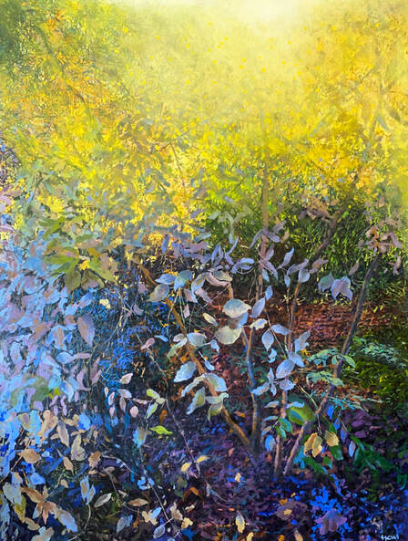 “Leaves of Contemplation”, 36" x 48", oil on canvas, © Patrick Howe
I found these leaves near my house. If only the world would stop its craziness and spend more time looking at leaves! Walt Whitman celebrated leaves in his famous poem "Leaves of Grass," describing them as "the flag of my disposition" and symbolizing the inherent beauty and diversity of the natural world. He saw leaves as a reflection of life's vitality and interconnectedness. When light filters through leaves, it transforms the ordinary into a spectacle. The interplay of sunlight and foliage creates a mesmerizing dance of shadows and patterns. Each leaf acts as a prism, diffusing and fracturing the light, casting a dappled glow on the world below. It evokes a sense of enchantment and beauty, as if nature itself is painting a vibrant tapestry. The filtered light through leaves brings a serene and ethereal ambiance, inviting us to pause and appreciate nature's ephemeral artistry. Landscape painting in general holds a unique place in the realm of art, captivating viewers with its ability to transport them to distant places or evoke a deep connection to familiar scenes. It captures the beauty and grandeur of nature, allowing us to contemplate its vastness and sublime qualities. Through meticulous brushstrokes and careful composition, landscape artists capture the essence of a place, its changing seasons, and the interplay of light and shadow. It invites us to contemplate the passage of time, the cycles of nature, and our own place within the vast tapestry of the world. Landscape painting can awaken a sense of awe, inspire reflection, and provide solace in our increasingly urbanized and digital existence. It reminds us of the intrinsic value and magnificence of the natural world. A floating picture frame conveys a sleek and modern aesthetic and creates a sense of depth. It highlights the painting by appearing to suspend it in mid-air, allowing for easy appreciation from all angles. Plus, its minimalist design complements various decor styles. 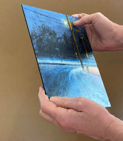 The word “board” and “panel” are synonymous. Some board comes already primed with gesso. If you get board that is not primed, you will need to put three coats of acrylic gesso on it before you begin oil painting on it. 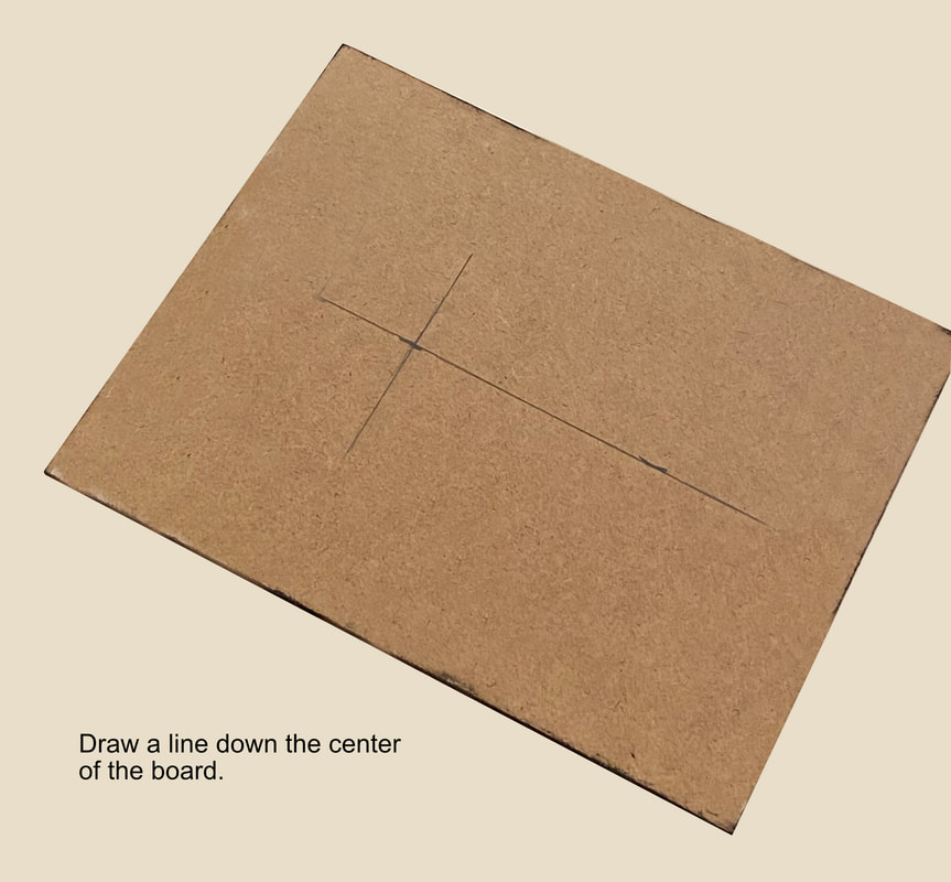 Measure the width of the board, mark the midpoint, and draw a straight line from one end to the other, ensuring it passes through the marked midpoint. Draw another line indicating where the top of the board will be. 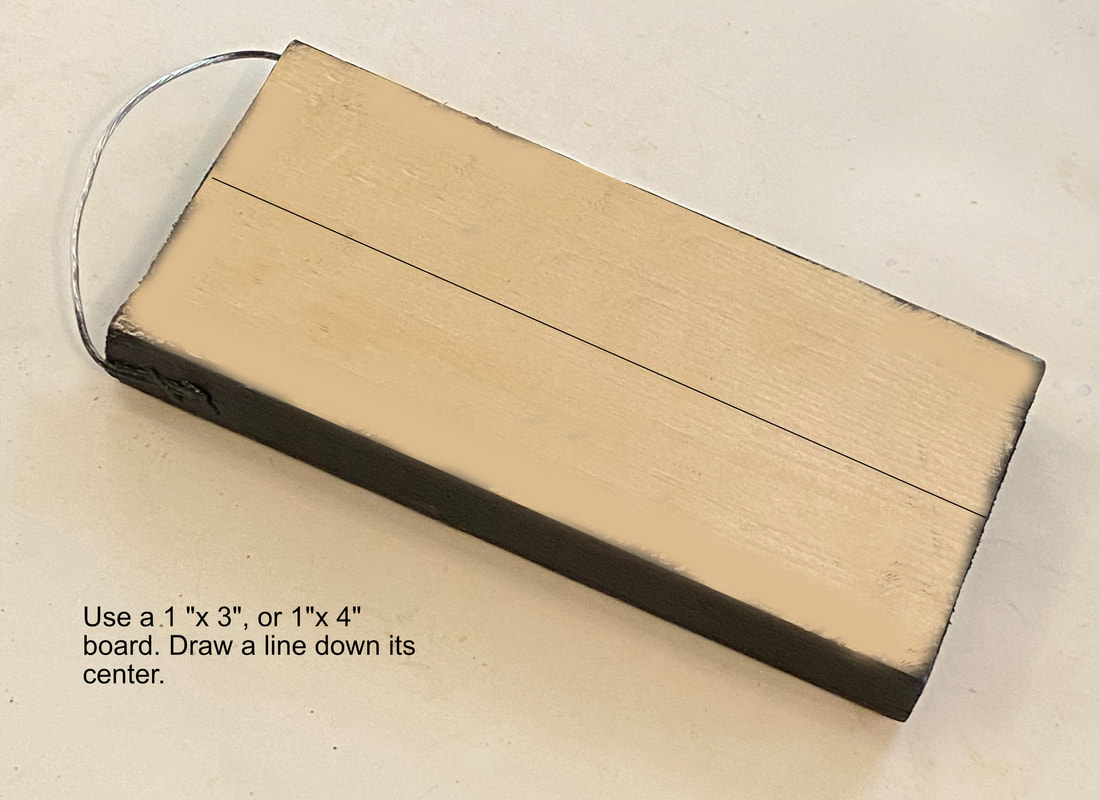 Use a piece of 1"x3", or 1"x 4" board and draw a line down its center. Paint the edges black so they won't show later. Staple of screw a piece of wire to the wood. 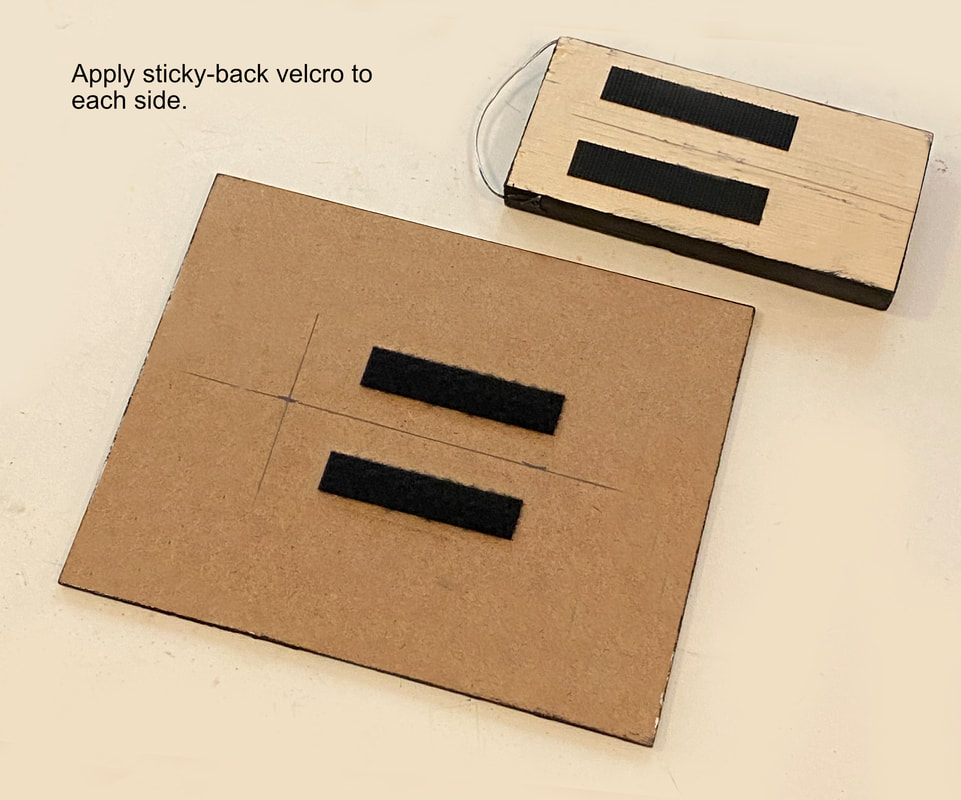 Mark on each piece of wood where to Velcro will align. Peel off the backing from the stick back Velcro, align it to each board, and firmly press it down to ensure proper adhesion. 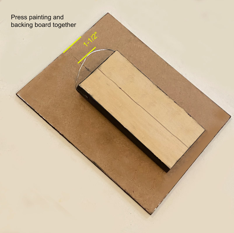 Press the two boards together. Make sure the wire is at least 1-1/2" lower than the top of the board. This is so the wall hook will not appear when the painting is hung. 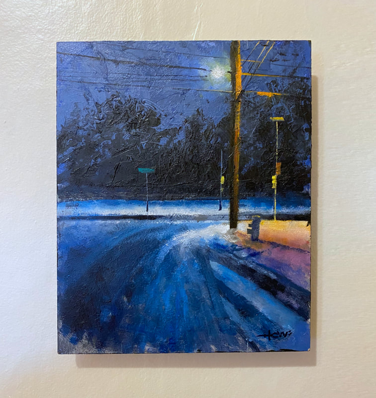 Painting appears to float off the wall. Notice that you do not see the wire or hanging hardware visible at the top of the painting. 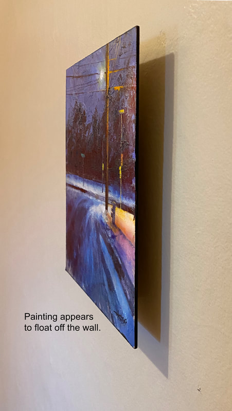 From the side, the backing board should not be visible. 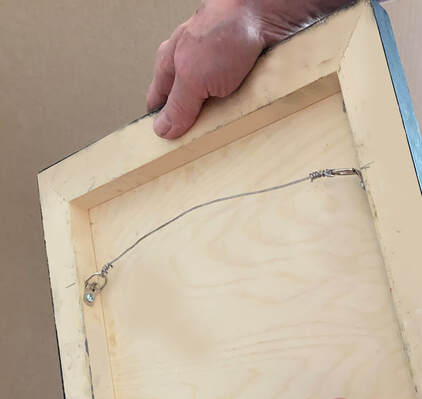 To hang cradled board, or stretched canvas, attach D-rings to the inside of the support members. This will insure the painting lays flat to the wall,
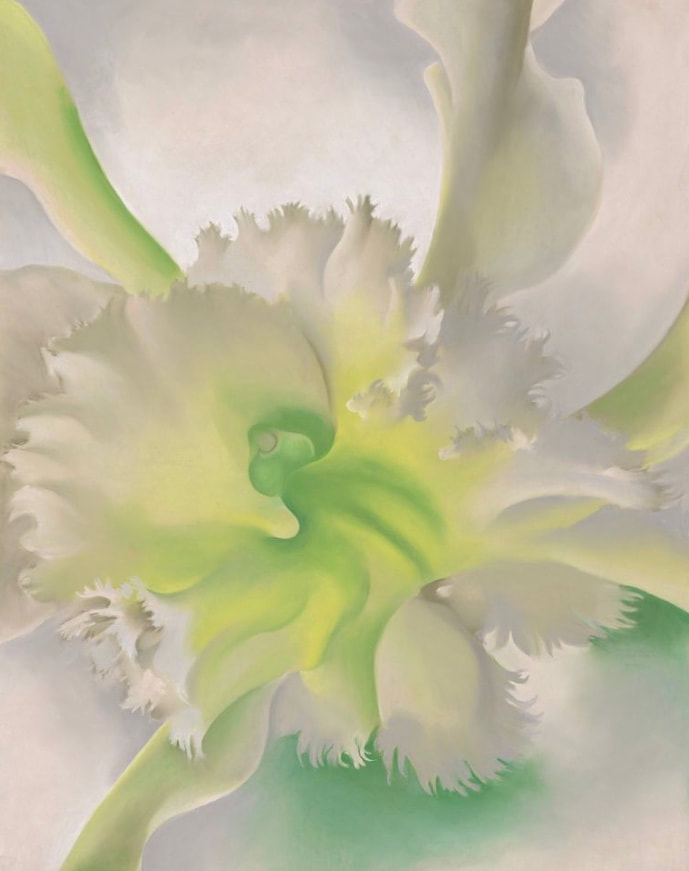
Yes, you can paint a picture on Masonite. Masonite is a type of engineered wood composite made from wood fibers, typically formed into a dense sheet using heat and pressure. It has a smooth, hard surface and is often used as a building material or as a substrate for painting and other artistic applications. 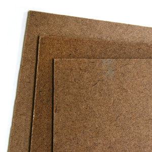 First, remove any dirt or debris from the Masonite. Then you can paint on Masonite if you apply three or four coats of gesso first. If the surface of the Masonite is smooth, then use light sandpaper to rough up the surface before applying the gesso. This will allow the gesso to adhere better to the board. If you are intending to produce a super-smooth surface to paint on, then apply each gesso layer thinly with a soft brush. Wait for the gesso to dry completely before painting. Be aware that if you apply the gesso thickly, the ridges of the gesso will appear in your painting if you apply thin layers of oil paint over it. This appearance is neither correct nor incorrect; it’s just an effect the painter needs to be aware of. Apply each layer of gesso at different angles. This will result in a smoother gesso surface:  (TAT #58) Artists often seek to express motion, or stillness, in their paintings. Here are examples of famous paintings shown side-by-side to compare their differences. 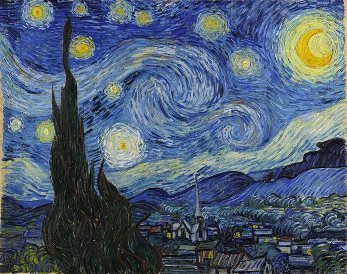 Vincent Van Gogh's "A Starry Night" Artists have tried for centuries to capture motion in their paintings. In this painting by Vincent van Gogh, he sought not only to convey the motion of the night sky but also the movement of the entire cosmos! It's a big vision that can be seen in so many of his works. His very application of the paint creates a sense of motion over every inch of his canvases. The motion in "A Starry Night," is depicted through expressive brushwork and a swirling composition. The sky is filled with rhythmic, spiraling brushstrokes that create a sense of movement and turbulence. The swirling patterns are echoed in the cypress tree and the village below, giving the impression that everything in the scene is caught in a dynamic dance. The energetic brushwork and the vibrant colors convey a sense of liveliness and motion, capturing the restless and dynamic nature of the night sky. Compare "A Starry Night" to Georgia O'Keefe's "A Force of Nature": 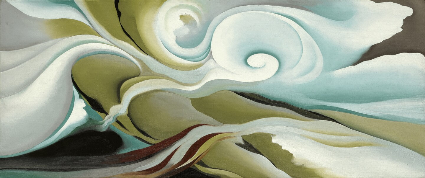 in Georgia O'Keeffe's painting "A Force of Nature," motion is conveyed through dynamic brushstrokes and vibrant colors. The composition captures a sense of swirling energy and movement, with sweeping curves and flowing lines that suggest the power and force of nature. The contrasting hues and overlapping forms create a visual rhythm that engages the viewer and evokes a sense of natural vitality and motion in the scene. Now, going to the entire other end of the spectrum of painting styles, let's compare O'Keeffe's "A Force of Nature" with Vermeer's "Milkmaid". 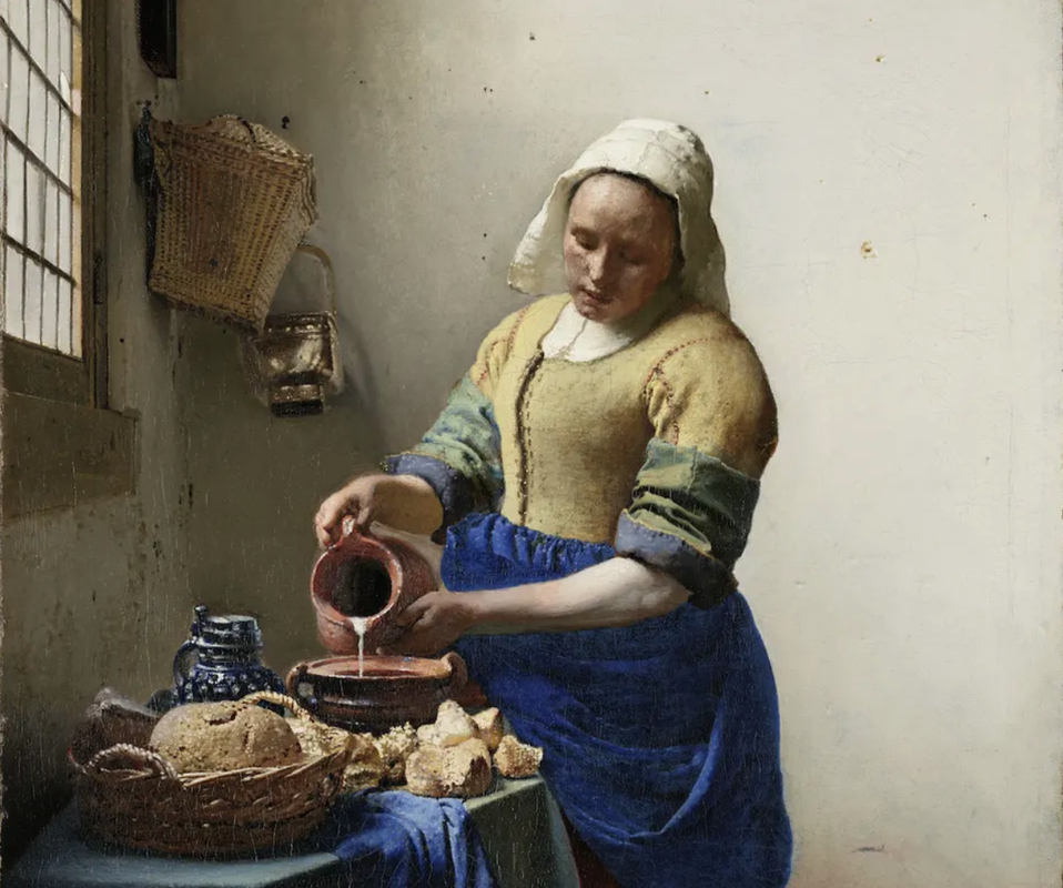 In Vermeer's painting "Milkmaid," a timeless stillness pervades the scene. The composition centers around a milkmaid engrossed in her daily task, frozen in a moment of serene concentration. The stillness is emphasized by the balanced composition, muted colors, and careful rendering of textures and light. The soft play of light on the milkmaid's figure and the simple domestic setting create a sense of quietude and timelessness, evoking a contemplative mood that transcends the passage of time. Now back again to a painting with intense force and power: 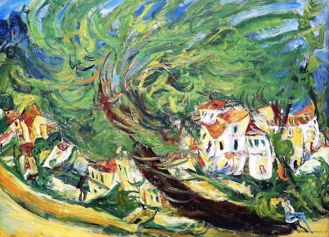 In Chaim Soutine's painting "Bent Tree," energy and motion come alive through dynamic brushwork and vivid colors. The tree, contorted and twisted, seems to pulsate with life. The forceful and bold brushstrokes convey a sense of movement, as if the tree is caught in a gust of wind. The vibrant hues and exaggerated forms further enhance the feeling of energy, imbuing the painting with a restless vitality. The overall composition exudes a sense of animated motion, evoking a dynamic and expressive interpretation of the natural world. Now, let's return to stillness again, with Edward Hopper's "Automat". 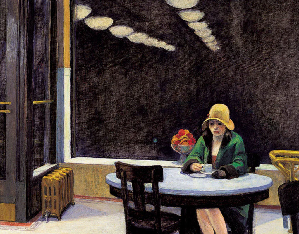 In Hopper's painting "Automat," a profound quietude envelops the scene. The solitary figure sits alone at a table in an empty café, engrossed in her thoughts. The muted colors, stark lighting, and absence of any other visible individuals contribute to a sense of stillness and isolation. The woman's introspective gaze and the empty space around her create a serene atmosphere, evoking a feeling of introspection and solitude. The painting captures a moment of quiet contemplation, inviting viewers to reflect on their own inner worlds.
Personally, I enjoy both energetic and quiet paintings. When done well, they both can evoke a delightful non-verbal appeal. Here is how to get your painting on loose canvas ready to display on a wall. First, paint your painting in a common frame size. Then apply YES Paste to the back of your painting and to a board of firm substrate, and press the two together. Let dry, trim, and you are ready to frame. Here are the details: Important to know before you begin your painting: If you paint on loose, primed canvas, make sure your painting is a common size if you intend to also frame it. Here are some common frame sizes, but new sizes are being added all the time, search around. 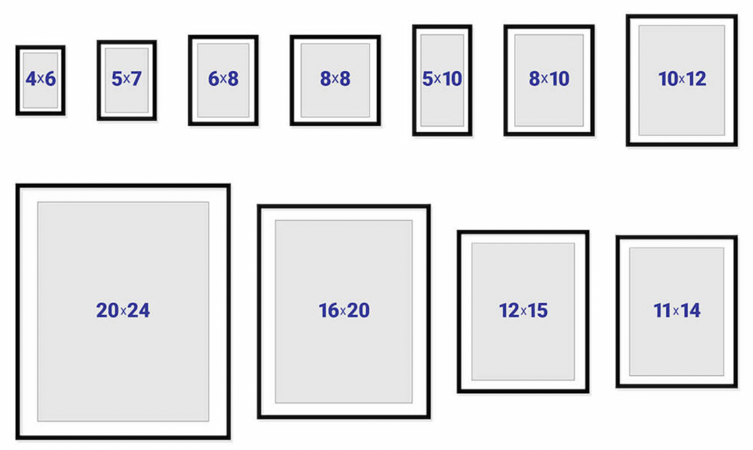 Below I am using the example of an 8"x 10" painting. Notice that the painting is painted on a piece of loose canvas that is larger than the painting era. Then, once your 8" x 10" dimensions are draw on the canvas, notice that the painting is actually painted 1/8" to 1/4" beyond the boundary of the painting's area. This is for trimming later. 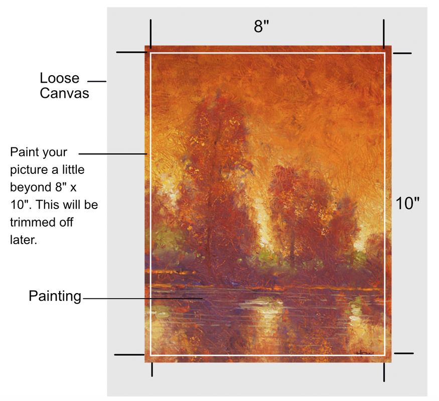 After you have finished painting your picture and it is dry, use a pushpin to poke a hole in each corner of the 8" x 10" era. (Not the corner of the trim era) 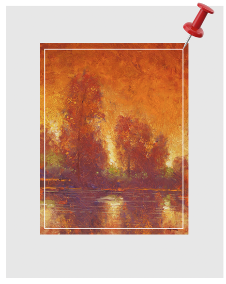 Next, turn the painting over to the back side. Find the holes you poked through the canvas. Then, draw a line between the holes. The box drawn will match the boundary of the painting on the other side. 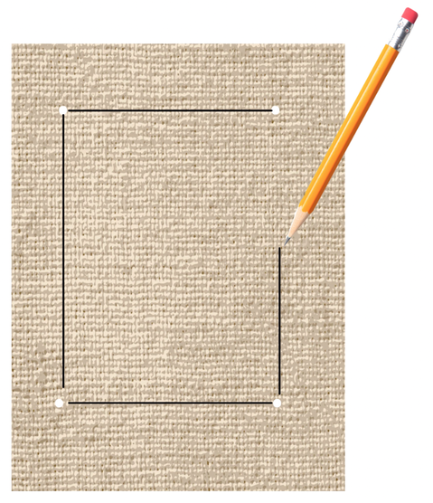 Apply 'YES Paste' to the back side. YES Paste is acid-free. So if the board is not acid-free already, the YES Paste will form an acid-free layer. Make sure you push to paste into the fabric so there are no air pockets. You can either cut your own board, or many art supply stores have cut board available. Apply the YES Past to both the canvas and board. Follow the instructions on the jar. Align the board to your boundary line and press the board firmly to the back of the canvas. Make sure the board you use is thin and firm. If it is too thick, it will not fit in a frame. 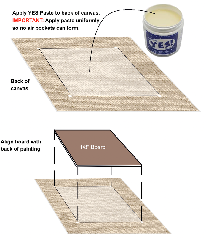 Press the board firmly so it is snuggly in place. Then flip it over to the front and press out any bubbles if there are any. Then gently, turn the painting to the back side again and make sure the board has not slid out of position. If it has, nudge it back into position. Next, place something heavy on the board to keep it pressed for 24 hour. In my example I used books. Important: while the paste is still wet, use a palette knife, or any sharp-edged instrument, and remove any excessive paste that may have squished out with the weight on it. If this paste is allowed to harden, if will be very difficult to trim later. 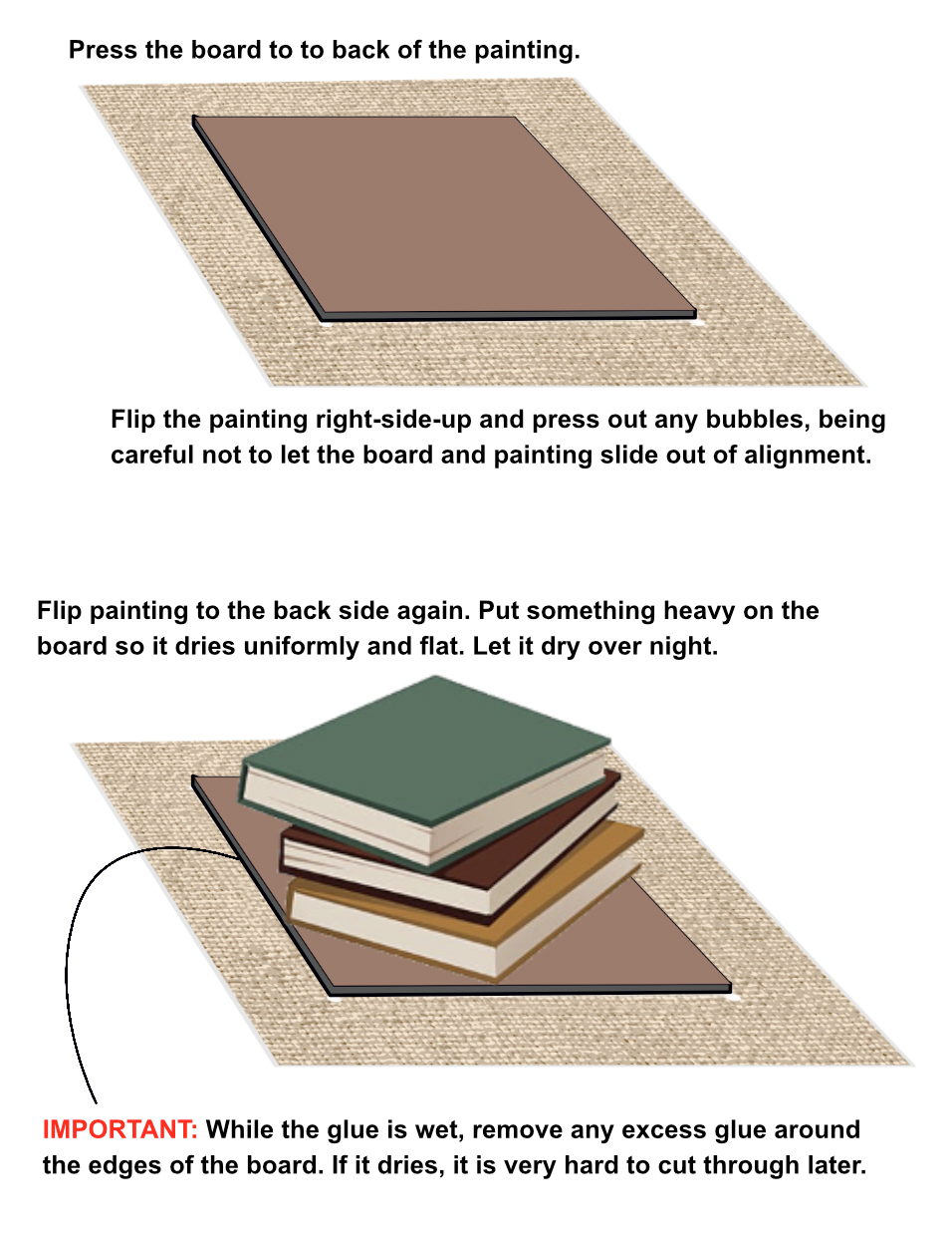 Another important reason to keep the weight on for 24 hours is that YES Paste is water soluble and could warp your painting if it is not held flat until it dries. After the YES Paste has dried completely, using a utility knife, trim off the excessive loose canvas from the board. 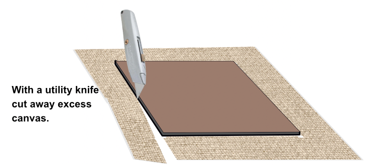 Your canvas painting is now mounted on board: 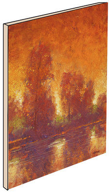 Cradled Board The same can be done on "cradled" board. Cradled boards are deeper, but the process is the same.  Using a Prefabricated Frame If you intend to fit your mounted painting into a prefabricated frame, remove the glass and mat that comes with the frame. They will not be needed. And, in general, you do not put glass over an oil painting. It doesn't need the protection, and the glare of glass makes viewing the painting difficult. 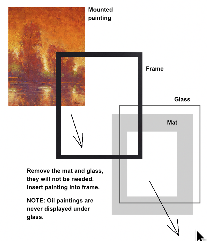 Floating the Painting If you wish to hang your mounted painting without a frame, you can make it "float" off the wall: 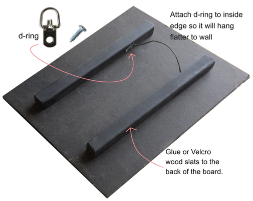 This PDF file is an overview of stretching you own canvas. Stretching your own canvas requires a lot of gripping. If you are planning to stretch many canvases you will need a pneumatic stapler and good tools. This PDF presumes you are stretching a large canvas that would need bracing in the back. Smaller canvases, under 24" x 24" will not need bracing. 
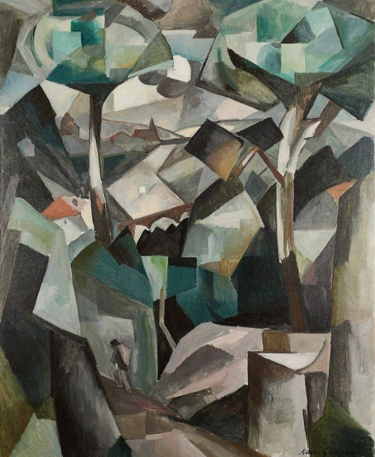
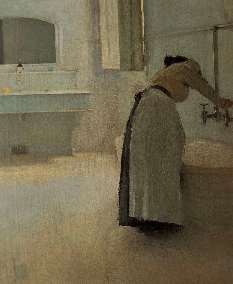
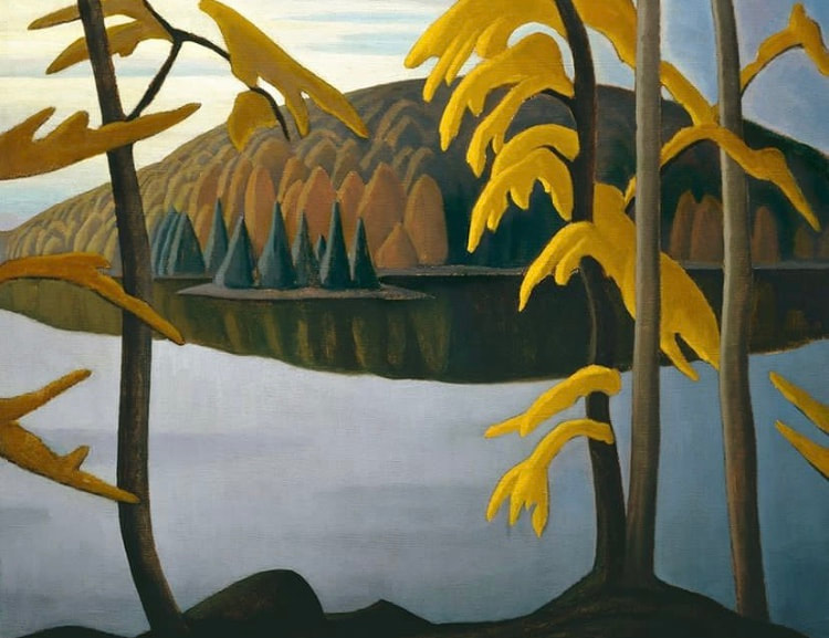
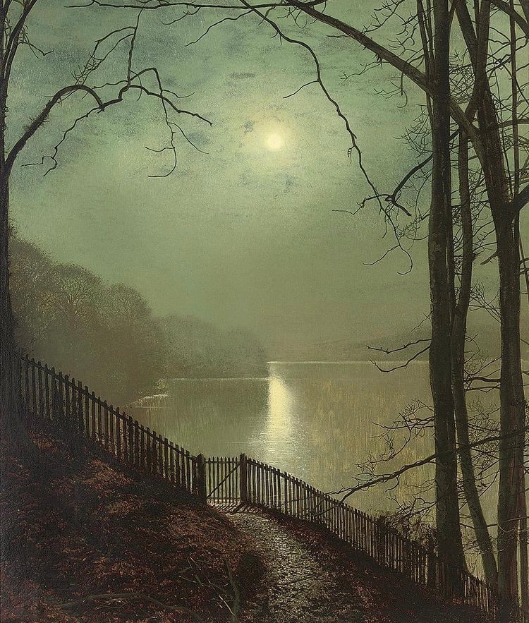
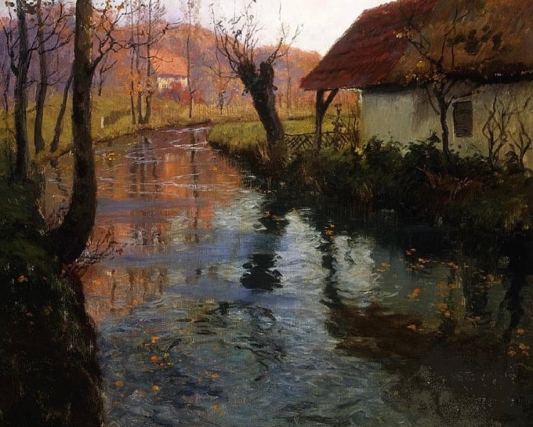
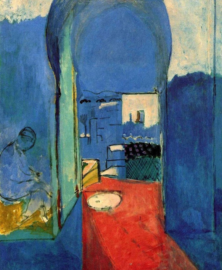
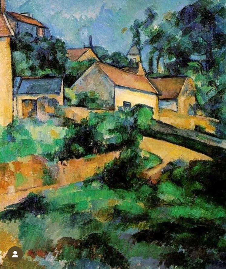
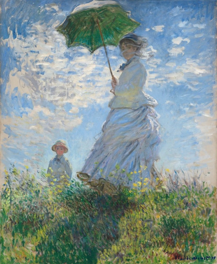
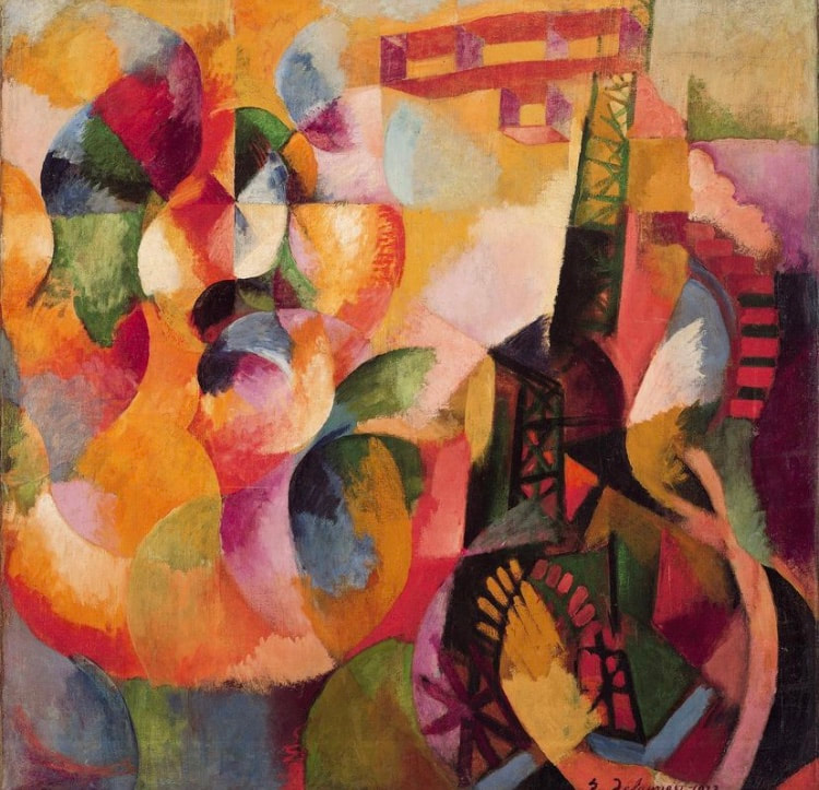
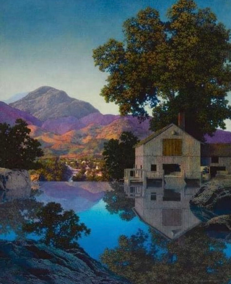
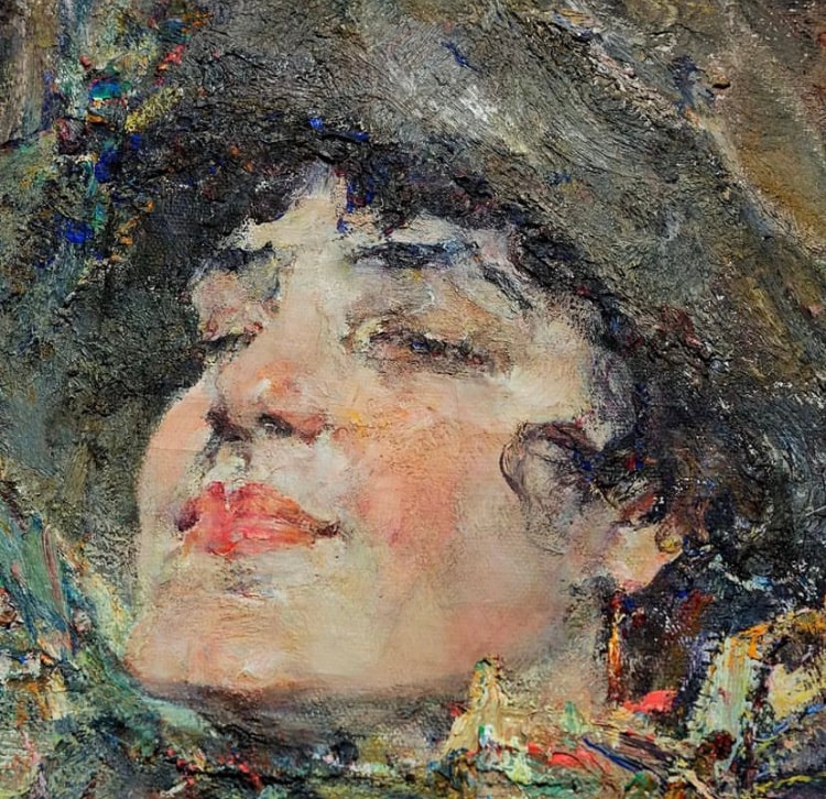
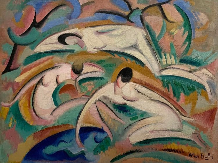
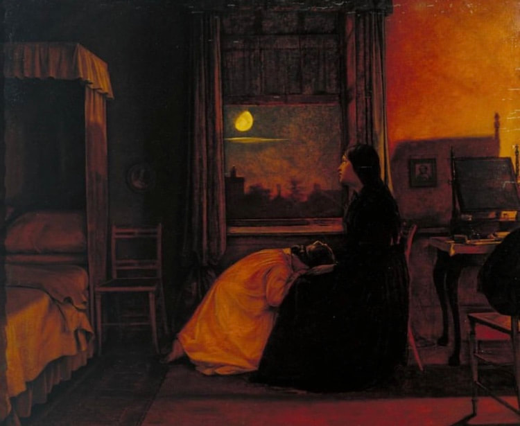
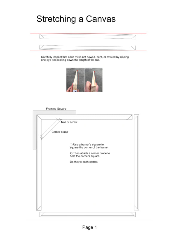 Avoid placing your bracing down the vertical center of the canvas, which would interfere with hanging hardware. 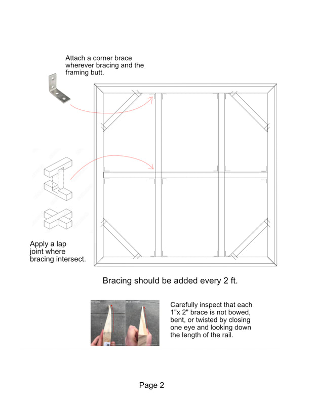 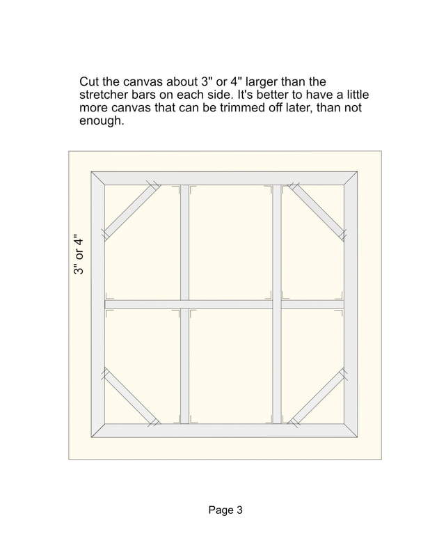 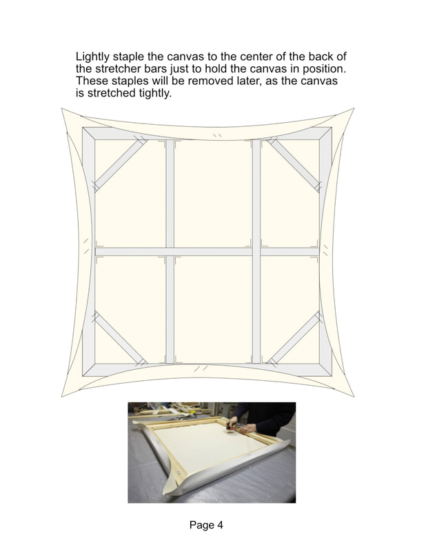 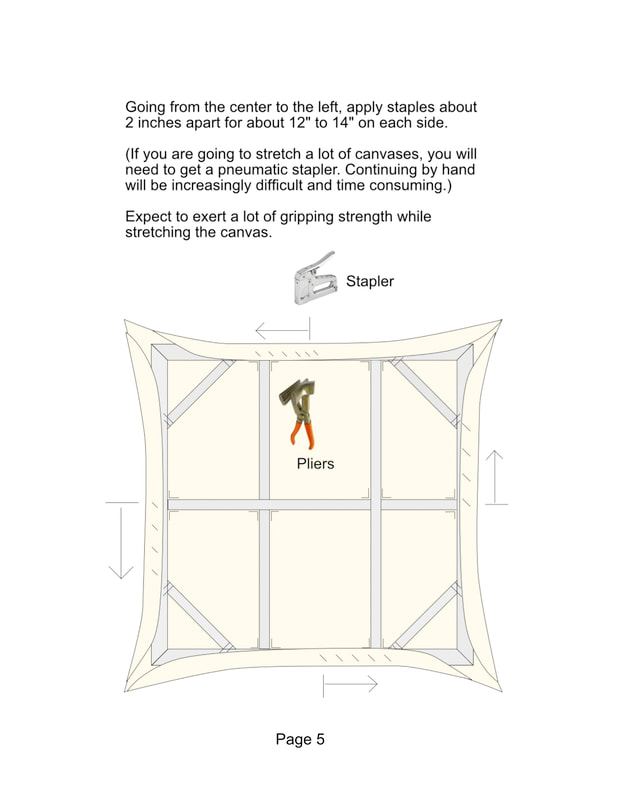 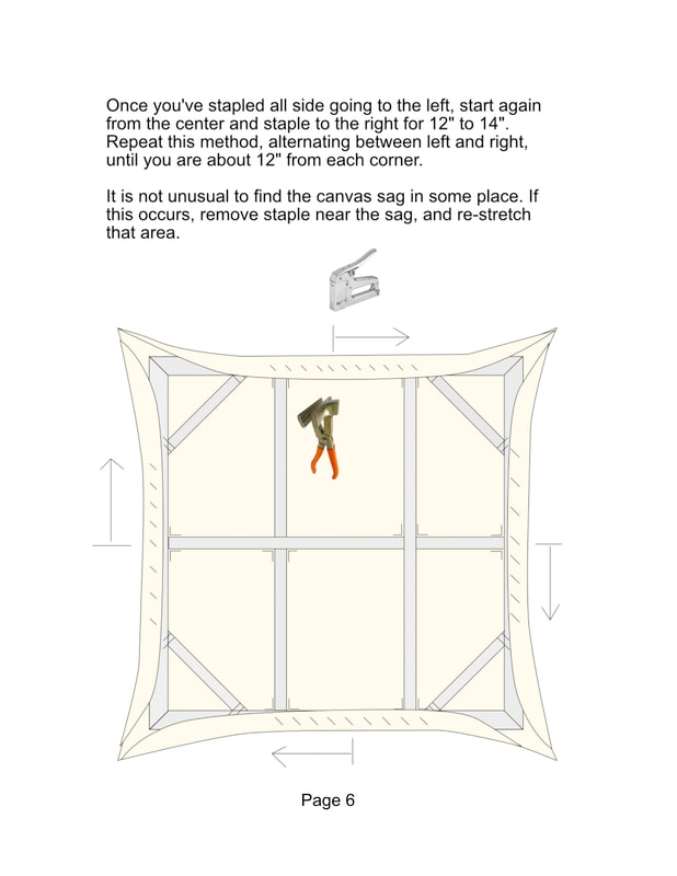 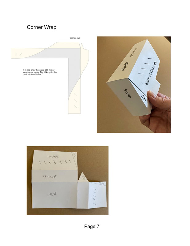 Examining and comparing a variety of paintings helps to develop a better understanding of painting composition. Here are several paintings in which to examine and compare their composition. Each of these paintings is effective for its own reasons. Take the time to study their differences and see how they might inspire your own painting. Read the captions to see my comments about painting composition. Check out these master painters. Each painting to their own tune. Here we have Cezanne, Monet, Parrish, Fechin, Klint, Klee, Lawrence, and others. Ask me about these styles and techniques in the studio and we can discuss.
Pumice Gel enables oil painters to texture their painting surface before painting. (It is also used by acrylic painters.) It is an acrylic medium, so you cannot mix oil paint into it. The pumice gel must be completely dry before applying oil paint over it. If the gel is too stiff and grainy straight out of the jar, you can use acrylic medium or molding paste too thin it. 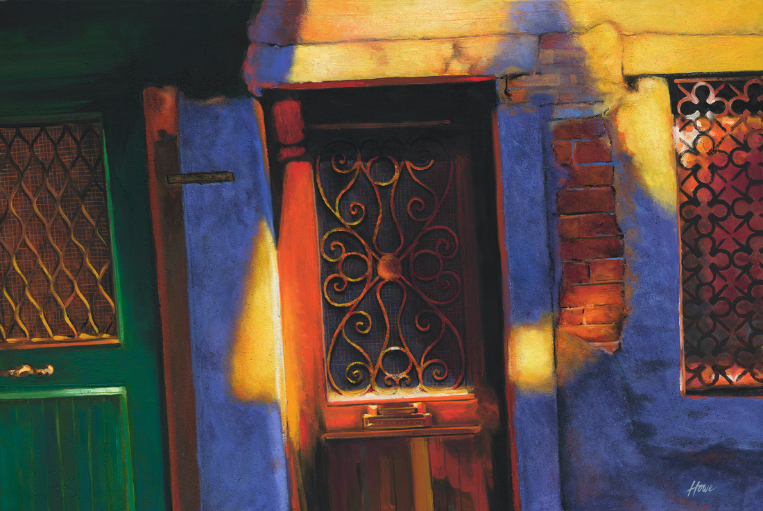 This is a painting of door in Venice that I did, and used a lot of Pumice Gel. The gel comes in fine, course, and extra-course. In this 3 ft x 5 ft painting, I used the course gel. The extra course would have been way too grainy. 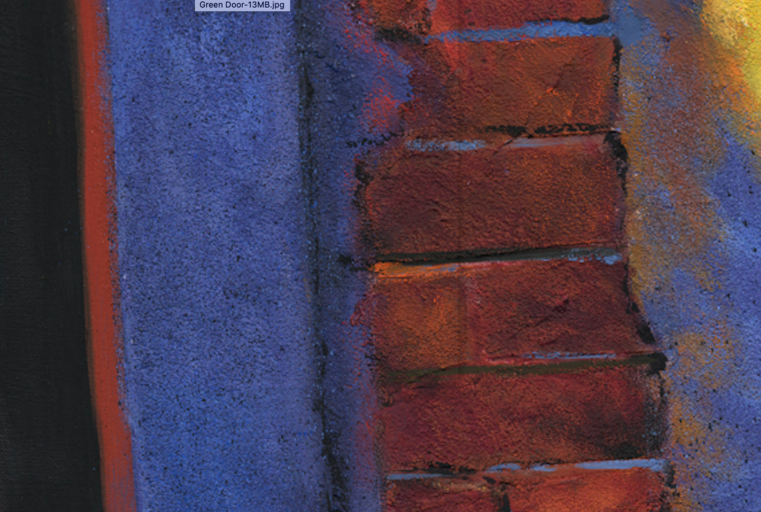 Here is a close up of the grainy surface of my painting. 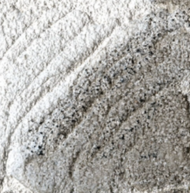 This is what the gel looks like straight out of the jar. 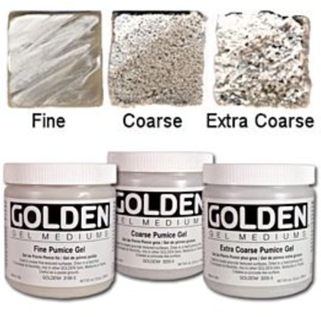 Pumice Gel is made by Golden.
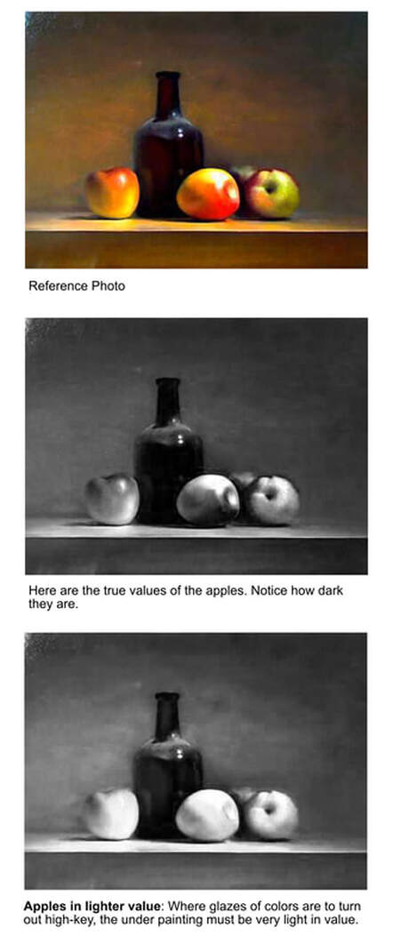 Indirect painting is when the painter paints the picture first in black and white (a grisaille) or in warm tones such as Burnt Umber. Then, after it dries, the painter applies glazes of colors over it.
However, what I wish to point out is that for glazing to be effective over a black and while underpainting, the high-key colors (bright reds, greens, and yellows) must be painted in extra-light values. Notice the values in the bottom painting above, the apples are extra light. That way, when the bright, high-key colors are applied over the apples, you will be able to maintain their intense color saturation. Conversely, if the apples in the black and white painting were painted in darker values, the glazing over the top of them would only produce a murky color and lack brilliance. (I don't know who painted the picture above, so unfortunately I cannot attribute it.) 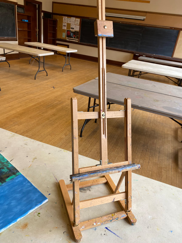 A tabletop easel is perfect for experienced and new painters alike. Pictured above is one that is light-weight and folds down for convenient transport. Follow this link for a guide on several kinds of easels for indoor and outdoor painting.
|
AuthorPatrick Howe Archives
July 2024
Categories
All
|
||||





 RSS Feed

|
Copyright © 2023, by Patrick Howe, all rights reserved.
Patrick Howe, Artist, Author and Educator Seattle, WA. Contact: [email protected] |
|